
Beacon Farm Website
The Challenge
The owners of Beacon Farm were seeking to increase campsite bookings and boost visits to their ice cream parlour and tea rooms. Feedback from visitors indicated that their existing website had a cumbersome, outdated design which was dissuading potential guests from visiting. It, therefore, needed to be replaced with a new, improved site.
My Role
I gathered and analysed customer insights, evaluated Beacon Farm’s current website, reviewed website metrics, researched competitors and used my findings to create a new, improved website.
Client
Beacon Farm
Team
Solo client project
Duration
6 weeks
Tools used
Adobe XD, Photoshop, WordPress, Google Analytics, Hotjar
18%
increase in campsite bookings in the 6 months following the site launch (compared to the previous 6 month period).
100%
of users tested following the launch of the new website found it easy to navigate and were able to locate key information quickly.
16%
increase in page views in the 6 month period following the launch of the new website. Bounce rate also decreased by 5%.
Approach & Outcome
Approach
With a tight deadline in place, I decided to conduct the project using the Design Thinking process, following the five stages of empathise, define, ideate, prototype and test. Utilising this approach ensured that the final website was tailored to the end customer’s requirements.
Outcome
The result of the UX process was an attractive, easily-navigable website with an improved user experience. Other key outcomes included:
- Higher rankings for relevant search terms achieved through in-built SEO
- An improved accessibility rating in line with Web Content Accessibility Guidelines (WCAG)
- A manageable back-end solution that enables the owners of Beacon Farm to edit website content on an ongoing basis
Client Testimonial
“
Stephen re-designed the website for our business and we found him amazing to deal with. Constant updates, great technical knowledge and great communication along the way. Very glad we chose to work with him.
“Stephen re-designed the website for our business and we found him amazing to deal with. Constant updates, great technical knowledge and great communication along the way. Very glad we chose to work with him.”
Matt Shardlow, Beacon Farm
”
Process
Phase 1: Research
1.1 Briefing
1.2 Evaluation of Current Website
1.3 Existing Customer Data
1.4 Competitive Benchmarking
1.1 Briefing
I setup an initial consultation to meet the client and learn about their specifications. This gave me the opportunity to understand their business model, service offering, desired customers, and current challenges.
A few of the key notes from the call are summarised below:
Service / product offerings
- Ice cream parlour
- Tea rooms
- Campsite
- Off-site cottage hire
- Wholesale ice cream sale
- Ice cream van hire
Key target audiences
Families and ice cream retailers (local shops and supermarkets)
Main challenges
- Few customers were hearing about Beacon Farm online
- Outdated website which users find cumbersome
1.2 Evaluation of Current Website
I carried out a heuristic and visual analysis of the current site to identify some of the initial problems that needed solving.
Main issues
- Poor accessibility rating
- Arduous booking process
- Lack of consistency in visual design
- Poor accessibility rating
- Arduous booking process
- Lack of consistency in visual design
- Outdated branding and overall style
- Poor mobile and tablet responsivity
- Distracting background imagery
- Outdated branding and overall style
- Poor mobile and tablet responsivity
- Distracting background imagery
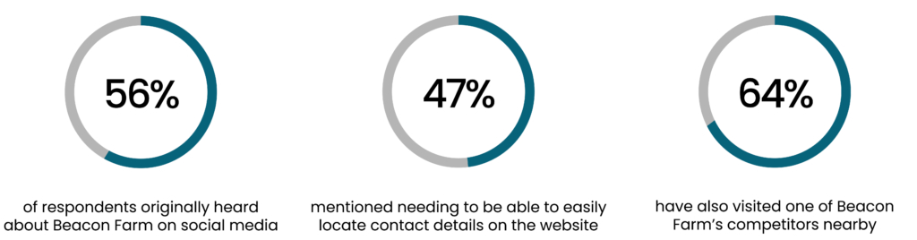
1.3 Survey and Customer Feedback
Several customers had been speaking to the owners of Beacon Farm and providing feedback on the website. To supplement this initial feedback, I conducted a survey and invited a sample of 25 customers to answer a range of carefully selected open and closed questions. Survey respondents were recruited using a GDPR compliant mailing list provided by Beacon Farm.
Other key findings
- Families tend to prioritise location, price, and entertainment when searching for a place to take their children
- Guests often call instead of using websites because of slow load times and information not being made readily available
- Respondents stated that most campsite websites have unnecessarily complex booking systems
1.4 Competitive Benchmarking
Benchmarking was used to analyse the positive and negative attributes of several competitor websites and to identify the design conventions that are commonly used in the industry. Competitors were chosen based on their proximity to Beacon Farm and the activities and services they offer. The businesses reviewed were Brymor Dairy, Yummy Yorkshire, Beadlam Grange, Betton Farm, and Spilmans.
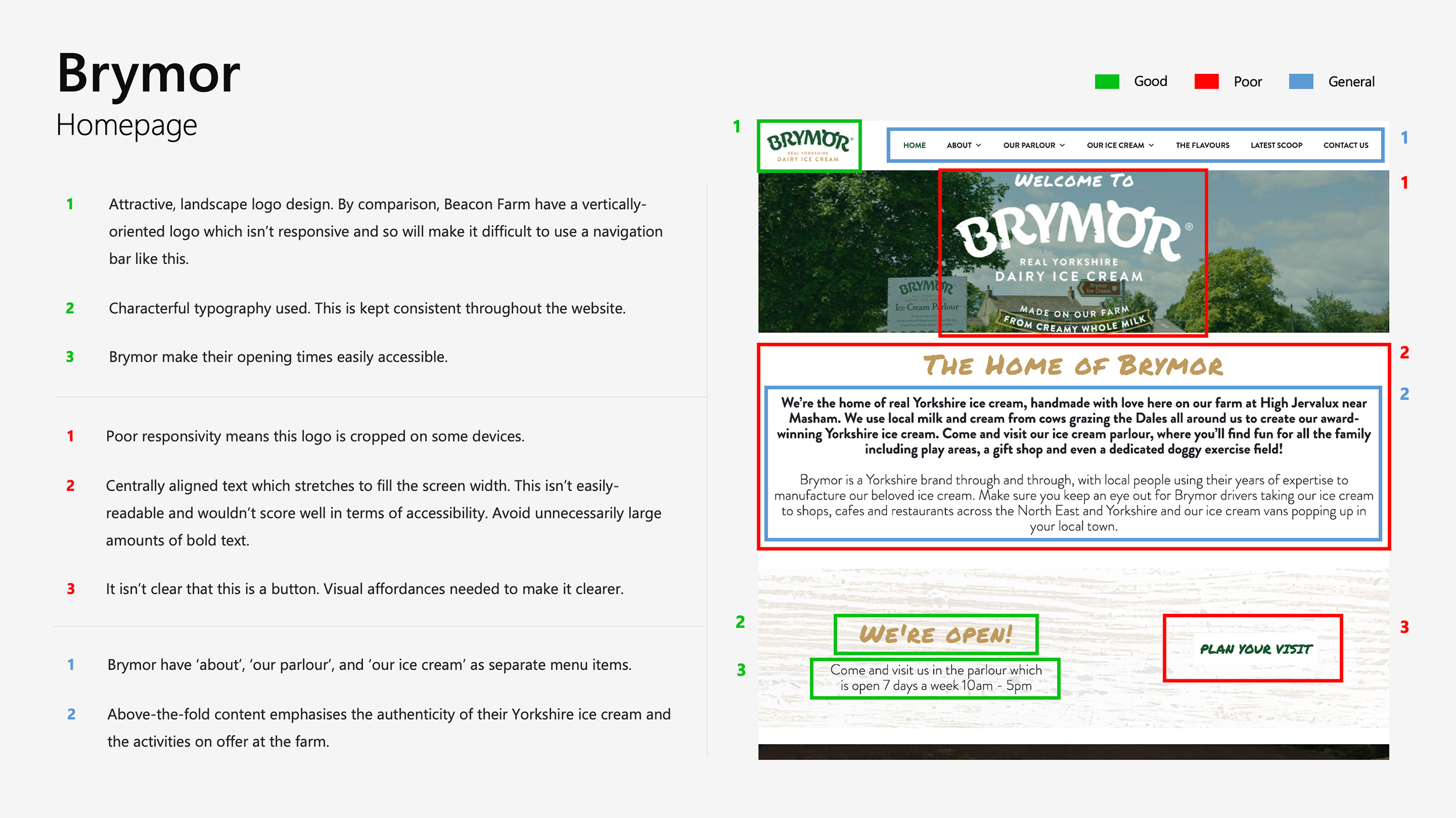
Key findings:
- Sites tend to contain a lot of multimedia content to keep users engaged
- The most effective websites tell a story about their business and introduce users to the owners
- The majority of competitor websites have poor accessibility. Keeping to web accessibility standards would ensure the new Beacon Farm site offers a superior experience
- Navigation tends to be overcomplicated with an unnecessary amount of informational pages
Phase 2: Analyse & Define
2.1 Quantitative Data Analysis
2.2 Keyword Research
2.3 SWOT Analysis
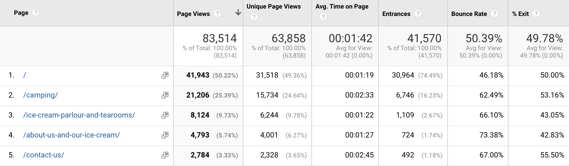
2.1 Quantitative Data Analysis
To build on the results from the surveys and competitor research, I worked on obtaining quantitative insights. Results from Google Analytics were reviewed to identify the current site’s areas for improvement.
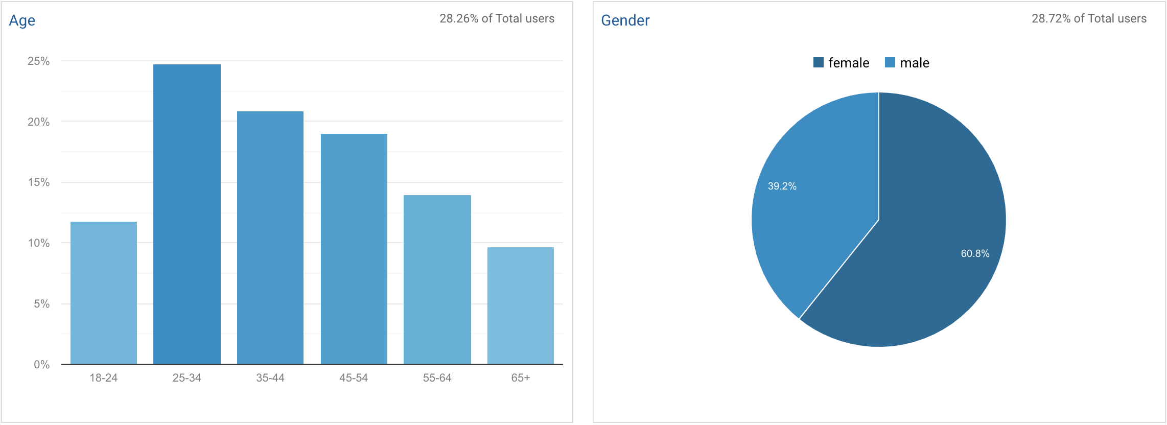
Online demographics were analysed to gain a more comprehensive understanding of Beacon Farm’s target audience (the largest demographic on their website was 25-34 year old women). This information, along with other research data, went onto inform my approach to the design phase.
Findings
Several webpages had high bounce rates and low session durations. This indicated that these pages were not keeping users engaged and so needed significant improvement in content and usability or, in some instances, needed to be removed entirely.
2.2 Keyword Research
Utilising the Google Ads keyword planner and Moz, I spent time researching keywords for ice cream parlours and campsites. I used my findings to analyse how Beacon Farm could improve their local search rankings with built-in, organic SEO.
Findings
Their existing website wasn’t ranking for several important and achievable search terms, including ‘Ice Cream Parlour Whitby’ and ‘Whitby Campsite’.
In combination with other SEO strategies, I ensured keywords were utilised in the metadata and site content to improve Beacon Farm’s rankings. The new site now ranks top on Google for ‘Ice Cream Parlour Whitby’.
2.3 SWOT Analysis
Notes were collated from the qualitative and quantitative research and key findings were extracted. Results were then structured using a SWOT analysis framework. This enabled me to pinpoint key features and functionalities to prioritise during the design phase.
This process also highlighted broader opportunities for the future that could be actioned further down the line.
Phase 3: Design & Validate
3.1 Sitemapping
3.2 Design System
3.3 Prototyping & Validating
3.1 Sitemapping
In Beacon Farm’s case, there is more than one user. User A may want to read about the ice cream parlour before visiting in person, User B may want to book to stay on the campsite, and User C may be looking to stock the farm’s ice cream as the owner of a local café.
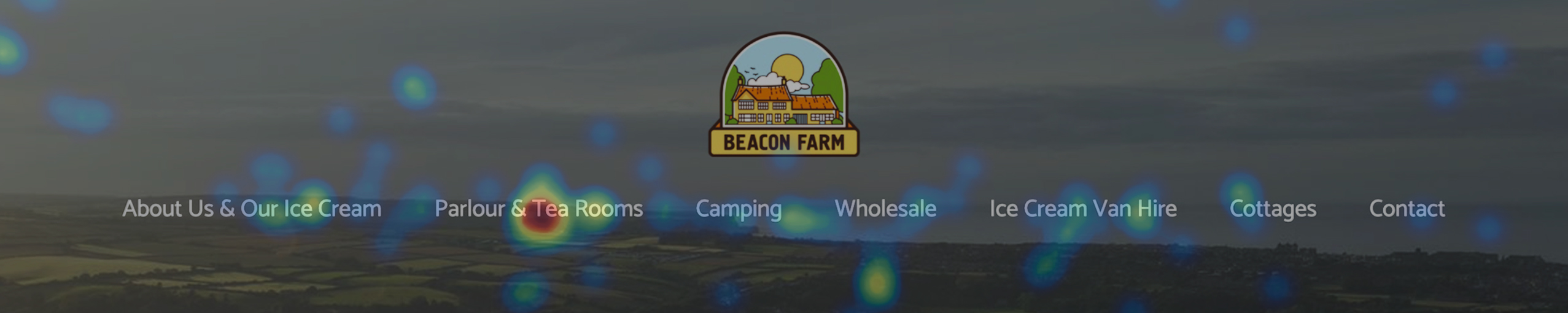
I needed to ensure the sitemap for the website met the requirements of each user and prioritised the common use cases. The global navigation was designed to display a single layer of options rather than a complex hierarchy, with the prioritised use cases listed first and the lower priority pages listed further along the menu.
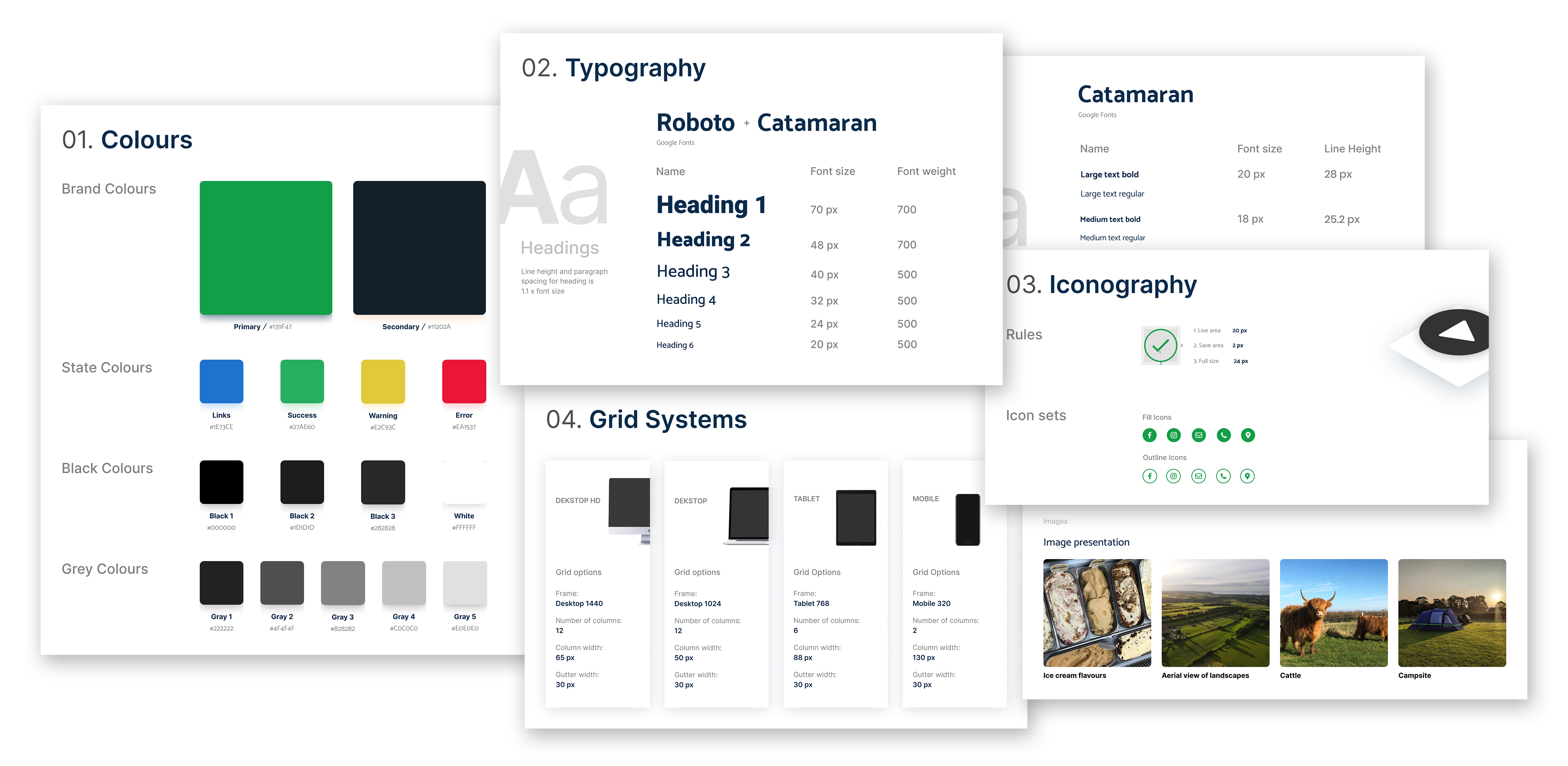
3.2 Design System
With the sitemap signed-off, I created a design system to be used during the website build. This provided a useful way to implement a consistent brand identity and to ensure each visual element was defined before building the website.
3.3 Prototyping & Validating
Using pen and paper and Adobe XD, I drafted several initial layouts for each webpage which were tested by friends and family members of different age groups. This iterative process enabled me to identify flaws, make improvements and validate design choices before developing the higher-fidelity prototype.
Liaison with the client was required during this phase to obtain text and imagery for each webpage.
Reflection
In future, it would be preferable to run usability testing sessions with a sample group of users rather than using my own connections.
Phase 4: Build & Test
4.1 Website Build
4.2 Testing
4.3 Reflection
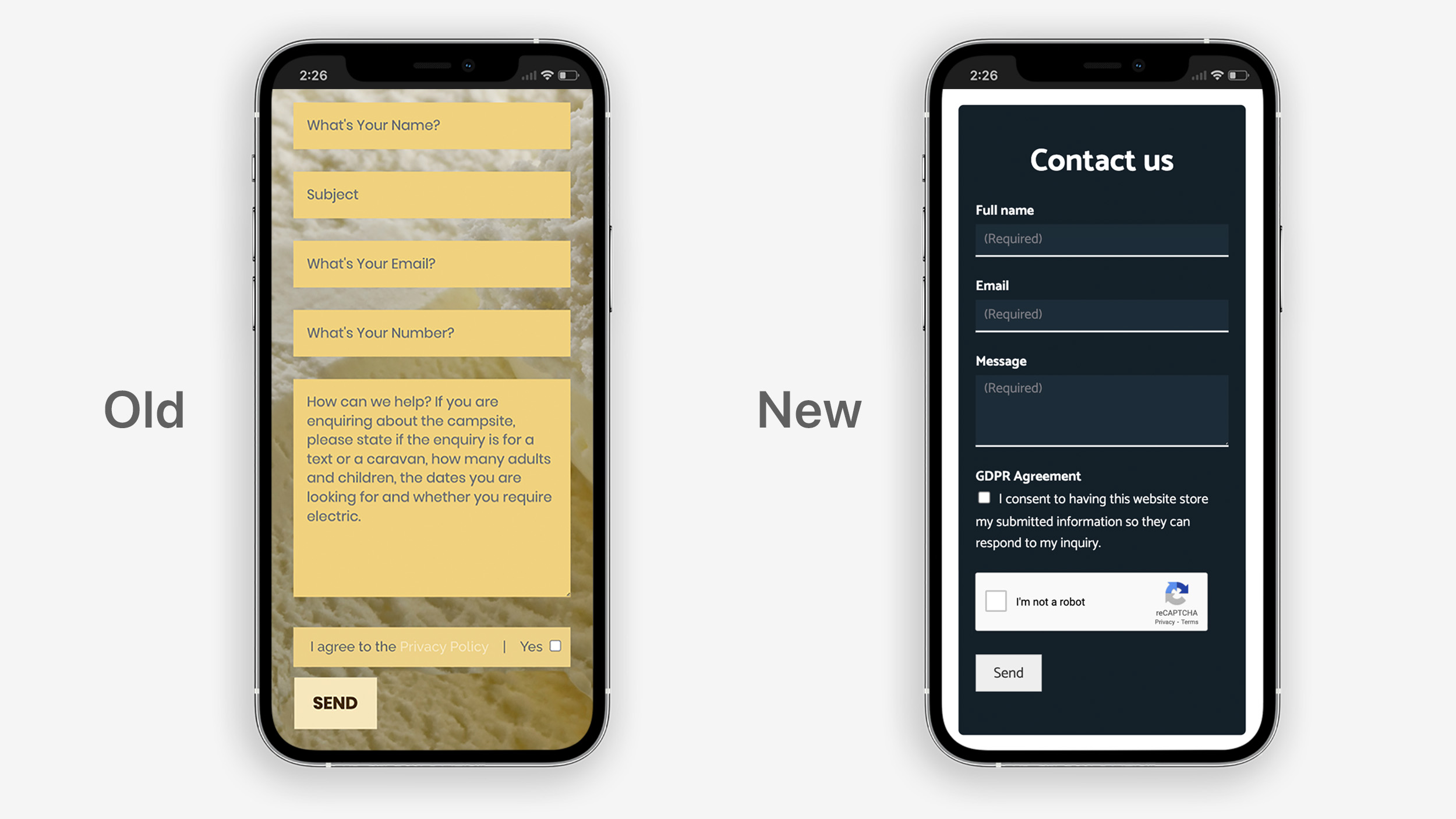
4.1 Website Build
At this stage, the prototype was developed into a responsive, user-centred website using WordPress and custom CSS and HTML where required. To guarantee success on search engines, several in-built SEO improvements were implemented and key search terms were included within each page’s metadata.
When the final website was launched, the owners of Beacon Farm and their customers were impressed with the significant improvements that had been made.
Once I had finished building the website, I migrated the client’s website, domain, emails, and hosting to a new server – a process that was new to me and so required a steep learning curve.
4.2 Testing
Following site launch, user tests were conducted. Participants were recruited using a customer mailing list provided by Beacon Farm. I ensured the test script allowed users to browse the website at their own pace, highlighting elements they found confusing or unclear.
Several improvements were made as a result of the sessions. These included re-ordering information contained on the camping page and simplifying the contents of the footer.
Website analytics, conversion rates, and Hotjar heat-mapping results were also used to analyse the site’s performance, with trends and key statistics being reported back to the client.
Reflection
Some of the feedback from user testing focused on issues with the booking system. Unfortunately, the client wished to continue using their existing booking API and so design improvements to the booking process were not as extensive as they should have been. In future projects, I would encourage stakeholders to consider implementing a new, superior booking system with a view to improving a crucial part of the customer journey.
4.3 Reflection
Overall, the project was a success. The new website has a significantly improved user experience and has resulted in an increase in campsite bookings and customer visits. The project was completed before the deadline set by the client and the owners were pleased with the new website.
Aspects that could be improved
The project could have been improved with more qualitative data from depth interviews and usability tests in the early stages of the project. However, time constraints limited my capacity to carry out user testing. In future projects, I would devote more time to user research and I would explain the value gained from reviewing the user’s process to key stakeholders in the early stages of the project.
Whilst designing the website, I chose to use centralised text on the mobile version of each webpage. In future projects, I would only use left-aligned text because it offers better accessibility, particularly for users with ADHD or Dyslexia.