
British Heart Foundation Events
About
British Heart Foundation (BHF) is the top UK charity for funding research into heart and circulatory conditions. As part of the charity’s fundraising efforts, they host a broad range of events. The aim of this project was to critically evaluate how the Events section could be improved and use findings to create a new template with a smooth user experience directed towards boosting event sign ups.
Scope
With a broader re-design of the whole Events flow in the pipeline, the focus of this project was to work on improvements to the design of Events sign-up pages.
My Role
I conducted a range of research methods, analysed the data and summarised the key insights. I then used findings to design a new mobile-first Events template which was handed over to Delivery to be built in the Sitecore CMS.
Company
British Heart Foundation
Team
UX Designer (me), Content Designers, Product Owner, Business Analyst, Developers, QA
Tools used
Figma, Miro, Useberry, Google Analytics
Deliverables
Annotated Figma wireframe, prototype and new components
Challenges
Inconsistency
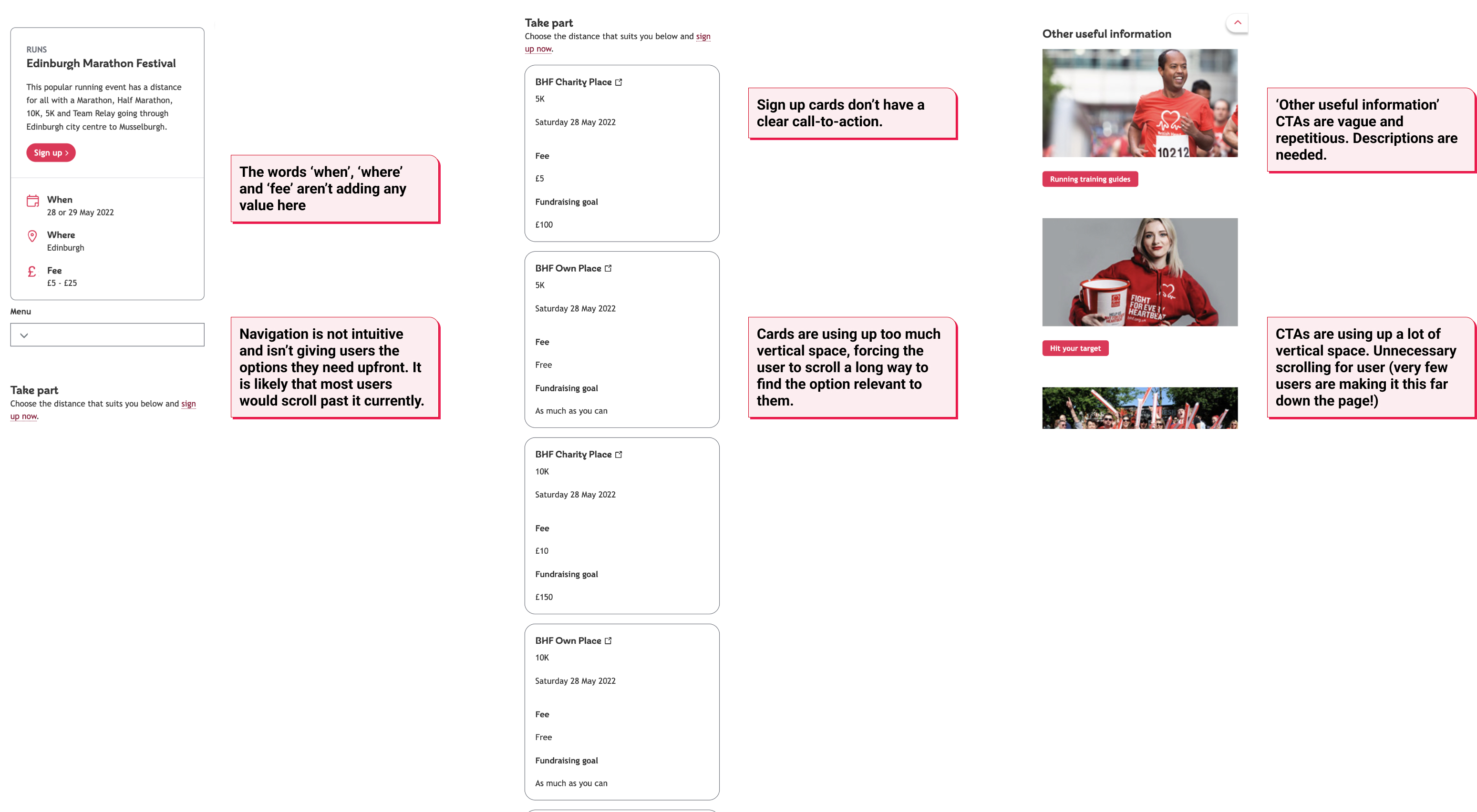
The lack of a standardised template resulted in Events pages with inconsistent layouts and, in some cases, out of date information.
Unstructured information
Events with up to 10 different sign-up options were appearing cluttered and visually overwhelming. We needed a new way of structuring these options.
Poor navigation
The in-page navigation was difficult to use and was causing confusion, particularly on mobile devices.
Difficulties with ongoing updates
The Events team needed to be able to keep on top of updating the events pages and needed a way to quickly mark events as ‘sold out’.
Low SEO score
We commissioned an external SEO agency to conduct a review of the Events section which highlighted several issues to be resolved.
Solution
A new template to be applied across all BHF’s Event sign-up pages with an intuitive navigation, clear structure and smooth flow.
Design Process
Research
Stakeholder workshop
Heuristic and competitor analysis
Heatmaps and session recordings
Usability testing
Define
Affinity map
Personas
User needs & flows
‘How might we’ statements
Design & Validate
Wireframe iterations with input from Content Design
Prototype
Usability testing
Deliver
Annotated wireframes & prototype handed over to Delivery
New components added to Design System
Monitoring
Phase 1: Research
1.1 Stakeholder workshop
1.2 Heuristic and competitor analysis
1.3 Heatmap and GA analysis
1.4 Usability testing
1.5 Reviewing SEO report
1.1 Stakeholder workshop
To gain an understanding of the core project requirements, the Content Designer and I held a stakeholder workshop with the Events team. The goals of the workshop were as follows:
- Summarise and categorise the team’s understanding of current user needs
- Discuss existing ideas about how to meet user needs
- Create proto personas using the team’s knowledge of existing customers
- Gather information on any issues the team were having keeping events pages updated
Key findings
- Users would like to be able to easily search events filtered by distance
- Several users would like information about the difficulty of the event to be clearer
- Our users need to be able to sign up quickly on mobile devices
- The Events team were struggling to keep pages updated due to the lack of a consistent template on the Sitecore CMS. Fields needed to be simplified and information needed to be automated where possible.
1.2 Heuristic and competitor analysis
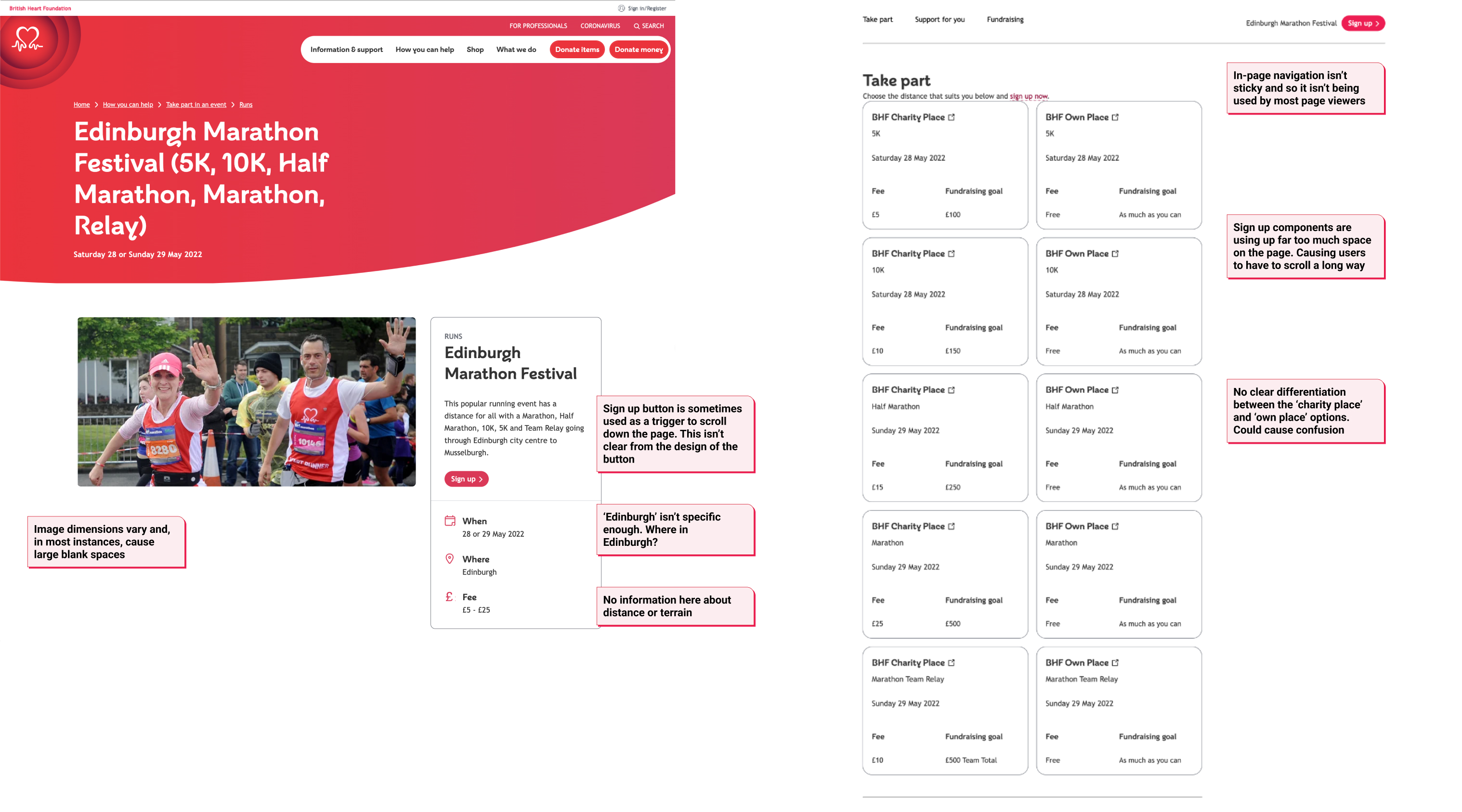
Following the stakeholder workshop, I conducted a heuristic analysis of the Events sign-up pages and noted several usability, accessibility and content issues to be resolved.
Competitor analysis was then used to benchmark our Events pages against other charity websites and to take inspiration from events websites outside of the charity industry.
Key findings
- Events pages are difficult to navigate on mobile – key issue as over 70% of web users on Events pages are using mobile devices.
- Analysing existing Events sign-up pages highlighted the range of variants which exist (e.g. some events have one sign up option, others have several). These were noted at this stage to ensure the new template design could be applied across the whole range of Events.
- Macmillan and Let’s Do This proved to be useful examples of websites with strong Events pages. Analysing these websites sparked several design ideas.
1.3 Heatmap and Google Analytics analysis
Using our customer experience analytics platform (Glassbox), I analysed sessions recordings and scroll & click maps to see how users were engaging with our existing Events pages. Google Analytics was also used to uncover key quantitative insights about our Events audience and the current behaviour on our Events sign-up pages.
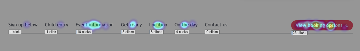
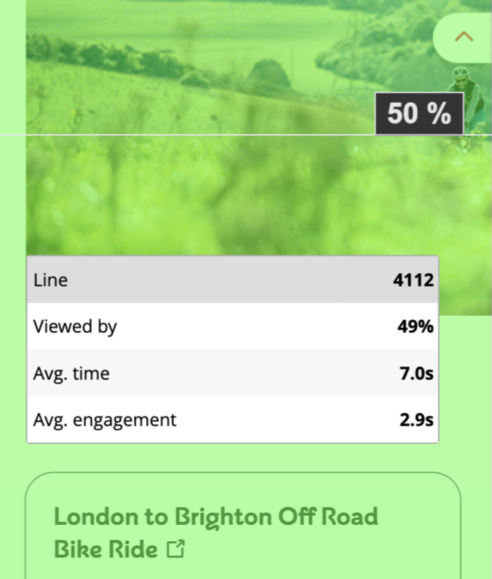
Key findings
On average, users were only scrolling 45% down the page on our Events pages with mobile sessions showing the lowest percentages. In several instances, this meant that over 50% of users were dropping off or scrolling back up the page before reaching the sign up options.
We needed to help users find the sign up options efficiently.
1.4 Usability testing
After recruiting participants through our patients and public involvement (PPI) network, I carried out several usability testing sessions to supplement the data obtained from heatmap analysis. The objective was to gain a more in-depth look at user behaviours and expectations during their navigation through the events pages.
Key findings
Our participant’s frustrations often centred around struggling with the in-page navigation and with feeling that it was too easy to lose the key details and sign-up options they needed when scrolling through the event pages.
1.5 Reviewing SEO report
Before we started working on this project, we commissioned an SEO audit from an external agency.
At this stage, we reviewed the results of the report and summarised some key actions to integrate into the Events sign-up page re-design.
Some key actions from the SEO review
Add ‘similar events’ to bottom of all event pages
Clearly distinguish between primary & secondary CTAs
Add FAQs with structured data
Remove any duplicate content
Revamp breadcrumbs and secondary navigation
Phase 2: Define
2.1 Affinity mapping
2.2 User needs & flows
2.2 How might we (HMW) statements
2.1 Affinity mapping
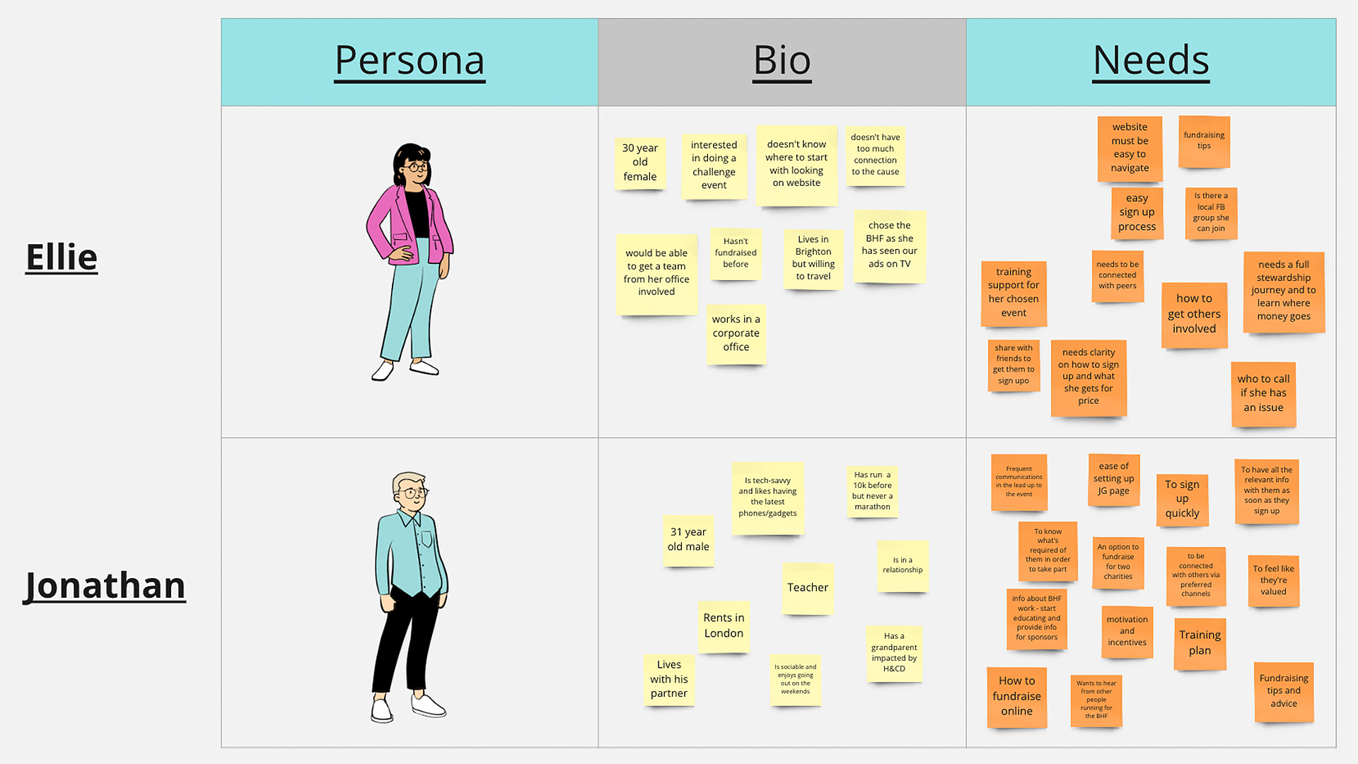
The ‘analyse and define’ phase was focused on structuring the unorganised data and extracting the key findings from each research method. To accomplish this, I facilitated an affinity mapping session with the team. We used the affinity map to organise the data from the research phase into groups whilst discussing priorities for design.

Reflection
- The affinity map highlighted key areas for development, including navigation, process & flow, call-to-actions, and imagery.
- The affinity map proved to be a useful tool for prioritising issues based on how frequently they came up in the discover phase.
2.2 User needs & flows
In this phase, we used the results of our research to define our main user needs and map out the usual flow. We summarised our three main user types for events as supporters, athletes, and volunteers.
Supporter
As a supporter of the BHF, I need to know how to take part in an event so that I can raise money.
- Show which events are available
- Explain how I can sign up
- Display the final date I can sign up
- Explain how fundraising process works
- Clear CTA to sign up
Athlete
As an athlete, I need to know the benefits of taking part in a BHF event, so that I can choose who to fundraise for.
- Show which events are available
- Explain the benefits of taking part in a BHF
- Clear CTA to sign up
Volunteer
As someone wanting to use my spare time to help , I need to know how to volunteer at an event, so that I can support the BHF.
- Explain how to volunteer
- Explain why they should volunteer
- Secondary CTA to sign up as a volunteer
Figma was used to create a flow diagram which gives context to how users are interacting with the Events sign-up pages within the broader journey.
Events user flow diagram
Reflection
- Summarising and visualising three user types, each with specific needs, helped to inform our design decisions throughout the project.
- Whilst mapping out the user flow diagram, I reviewed Google Analytics and Glassbox data which showed that the sign-up page was a stage with high drop-off. This confirmed that making improvements to this stage would lead to a significant improvement in the overall flow.
2.2 How might we (HMW) statements
‘How might we…?’ statements were used to frame challenges into questions that could be solved. One example of a HMW statement used was “how might we make it easier for athletes to quickly obtain information on the date, location, distance, and difficulty of their chosen event so they feel ready to sign up”.
Reflection
The HMW statements proved to be a useful tool for encouraging discussion within our project team around the core issues we wanted to solve and possible solutions.
Phase 3: Design & Validate
3.1 Wireframing
3.3 Prototyping
3.4 Prototype Usability Testing
3.1 Wireframing
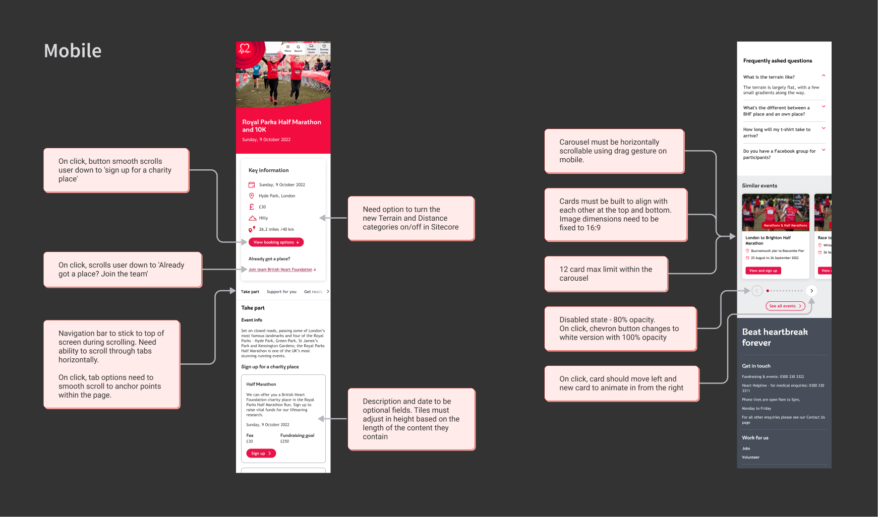
After empathising with users and identifying the key issues, I set about developing solutions to improve the event sign-up process.
Implementing an iterative approach, I came up with several design ideas which were discussed with the Product Owner, Business Analyst and Content Designer assigned to the project. At each step of the design phase, the wireframes were refined and the strongest solutions were identified. The Events team were also looped in and the UX decisions I had made were explained to stakeholders using the wireframes. They were then able to provide feedback.
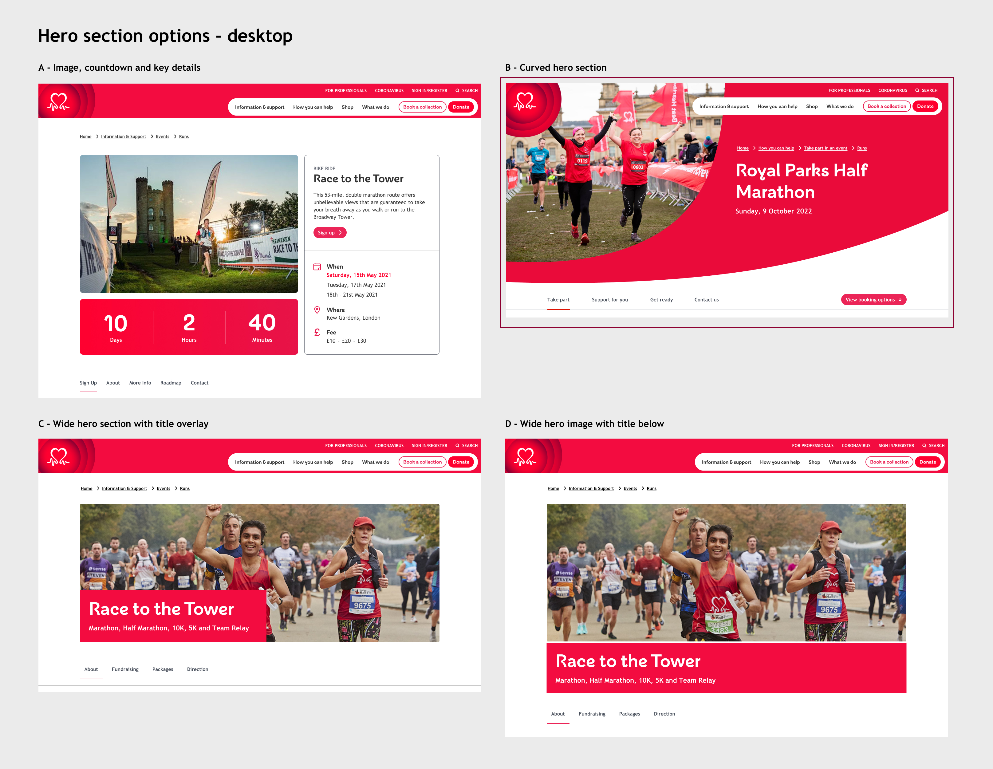
The images below show two examples of this iterative process. The chosen concepts are marked with a dark red outline.
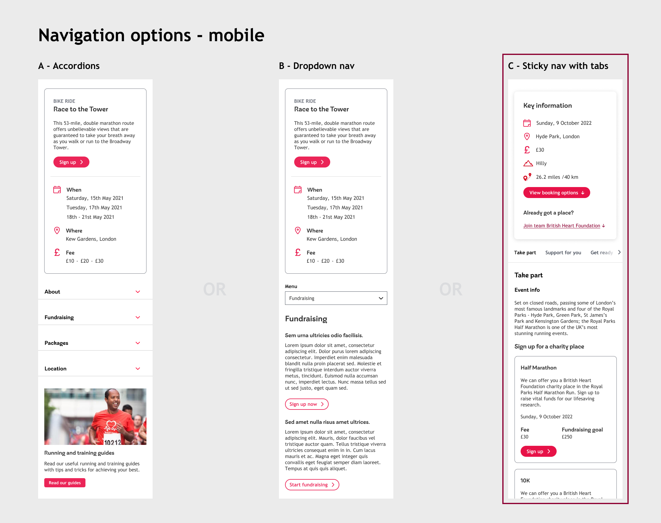
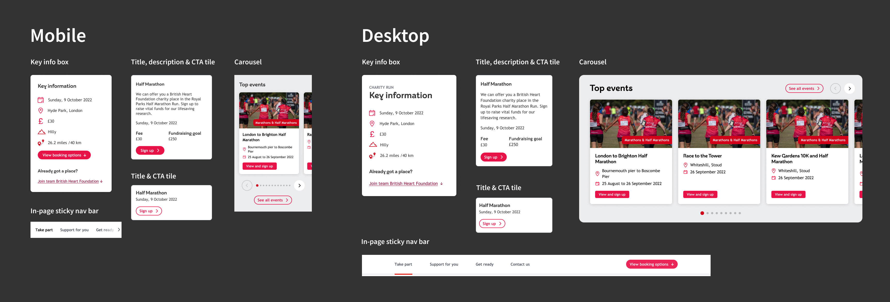
Navigation improvements
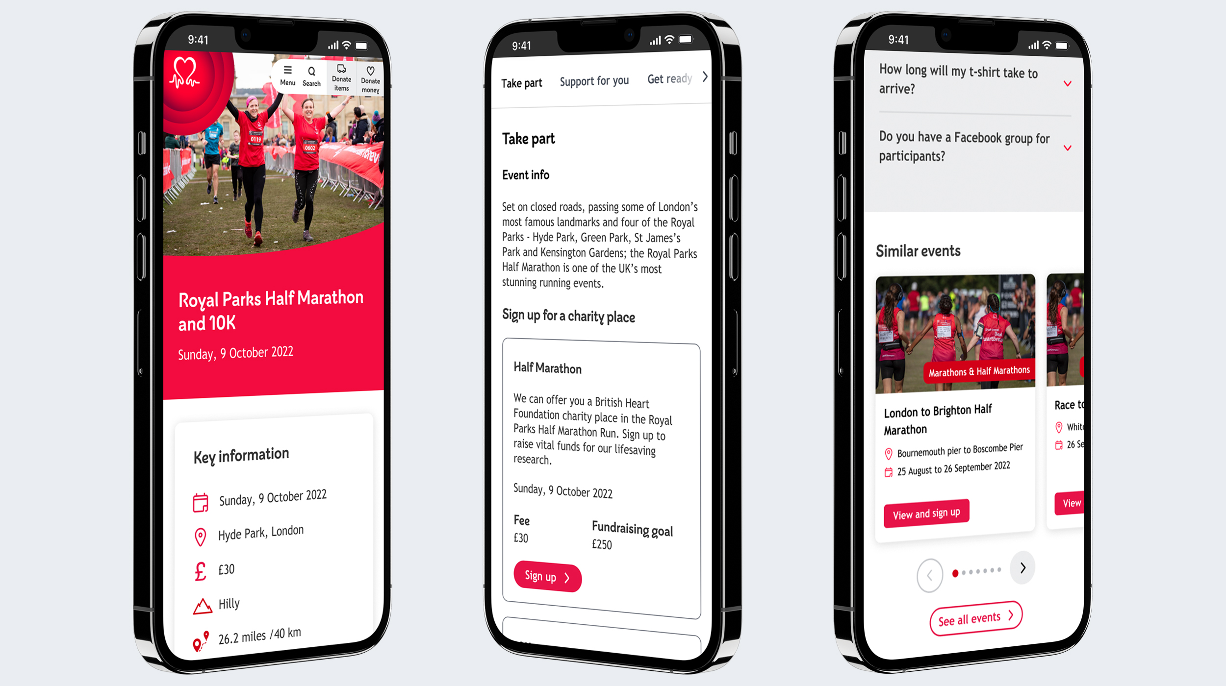
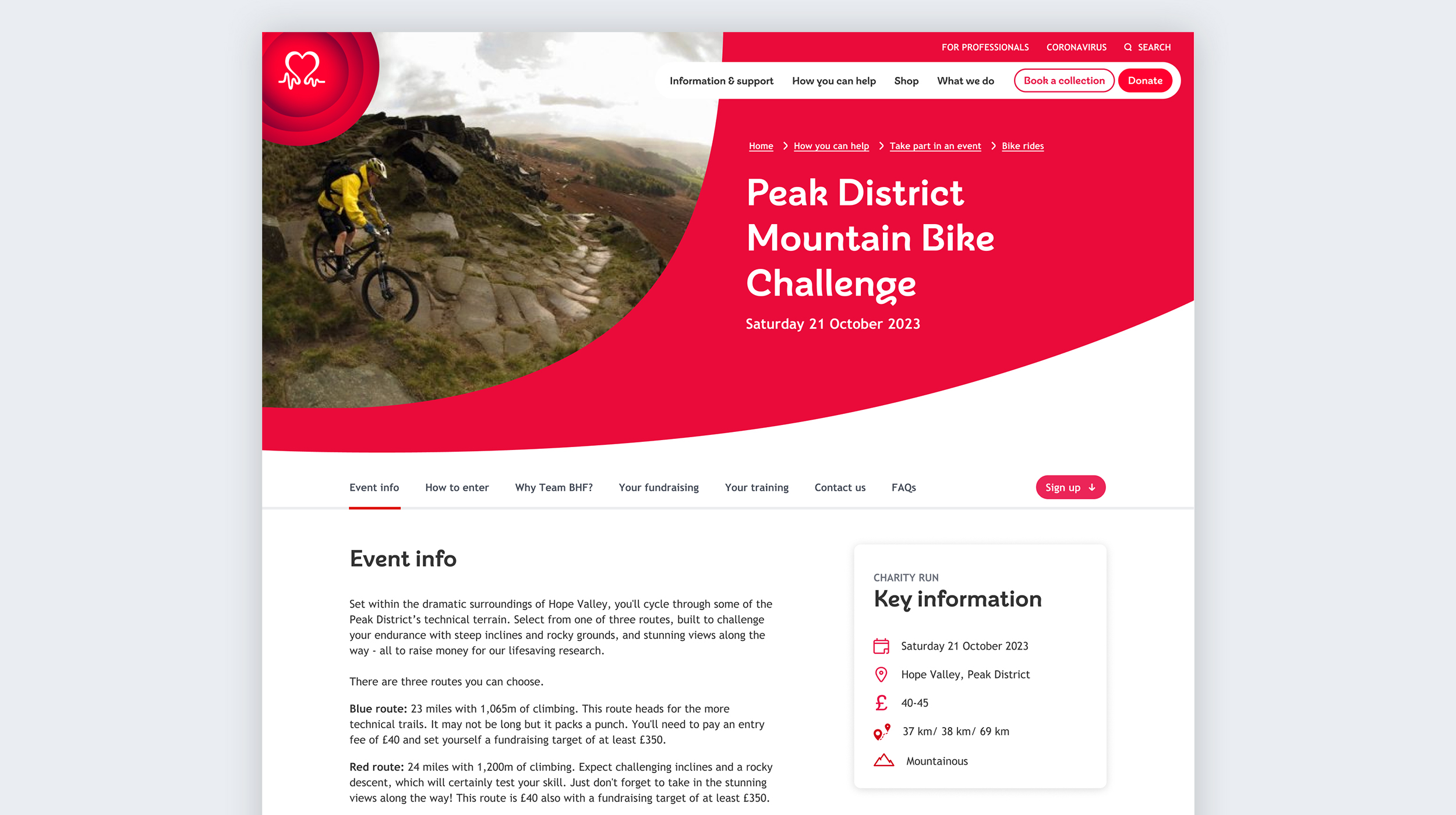
The in-page navigation was significantly improved during the design phase. The new template contains a ‘sticky’ nav bar on mobile and desktop which allows users to easily scan through the page by choosing the sections relevant to them. Previously the navigation was static and users were finding the mobile dropdown menu difficult to use.
New navigation
Old navigation
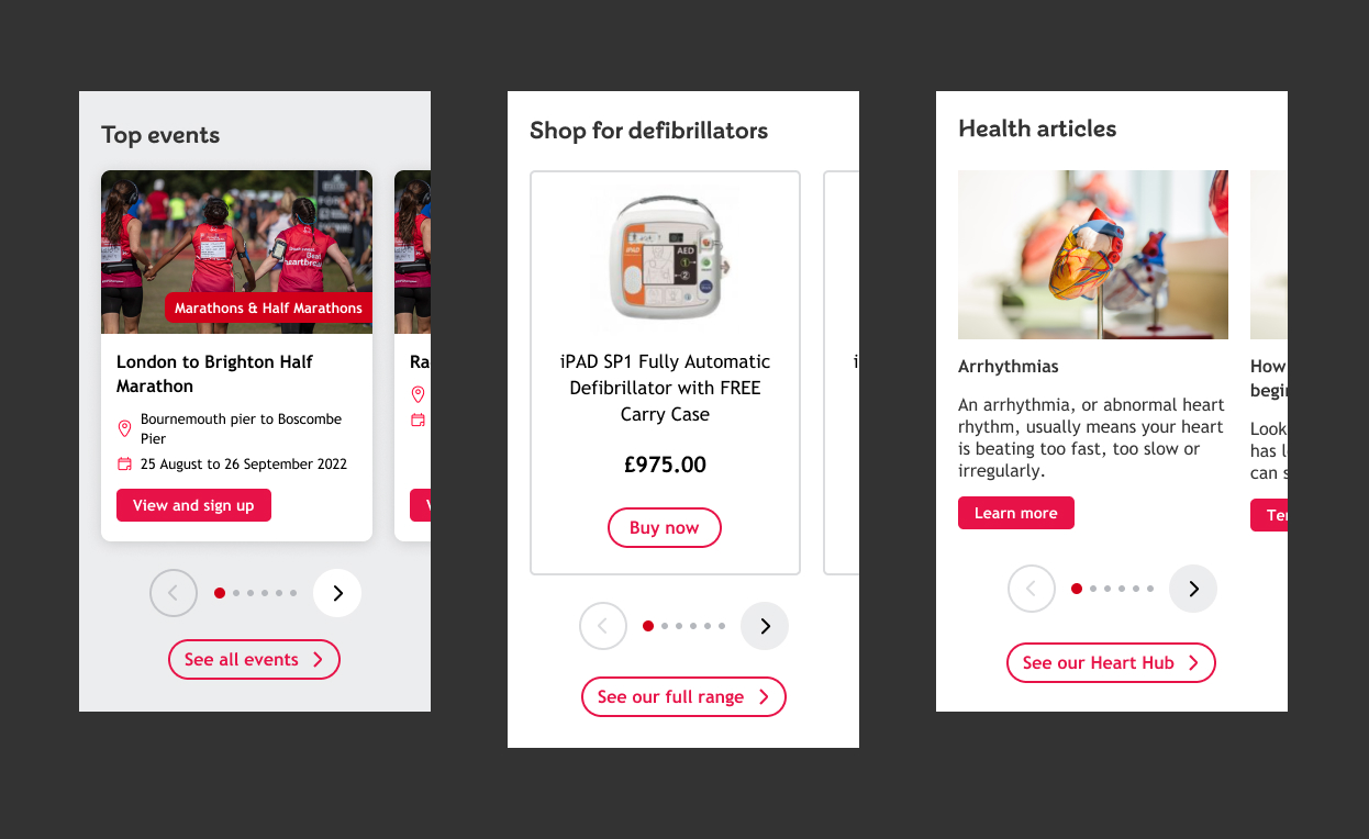
Carousel
As part of the template re-design, several new components were created including a carousel. The carousel allows users to easily find related events.
Joining up with the Delivery team, I ensured the carousel component was built with variants within the Sitecore CMS for use across different areas of the website (e.g. the shop and information & support). This approach (‘create once, use many times’) removed the need for unnecessary development work further down the line.
3.3. Prototyping
Using the chosen wireframe designs, I created high-fidelity, interactive prototypes for both mobile and desktop devices. The prototypes were useful for demonstrating animated & interactive functionality to stakeholders and other project members as well as Developers during handover.
Sticky key information box
As seen in the prototype recording above, a sticky key information box was added to the desktop template. With the box staying in place during scrolling, it allows users to easily refer back to the key event details whilst they scan through the page. Previously, users were having to scroll back to the top of the page to find the key information.
3.3. Prototype usability testing
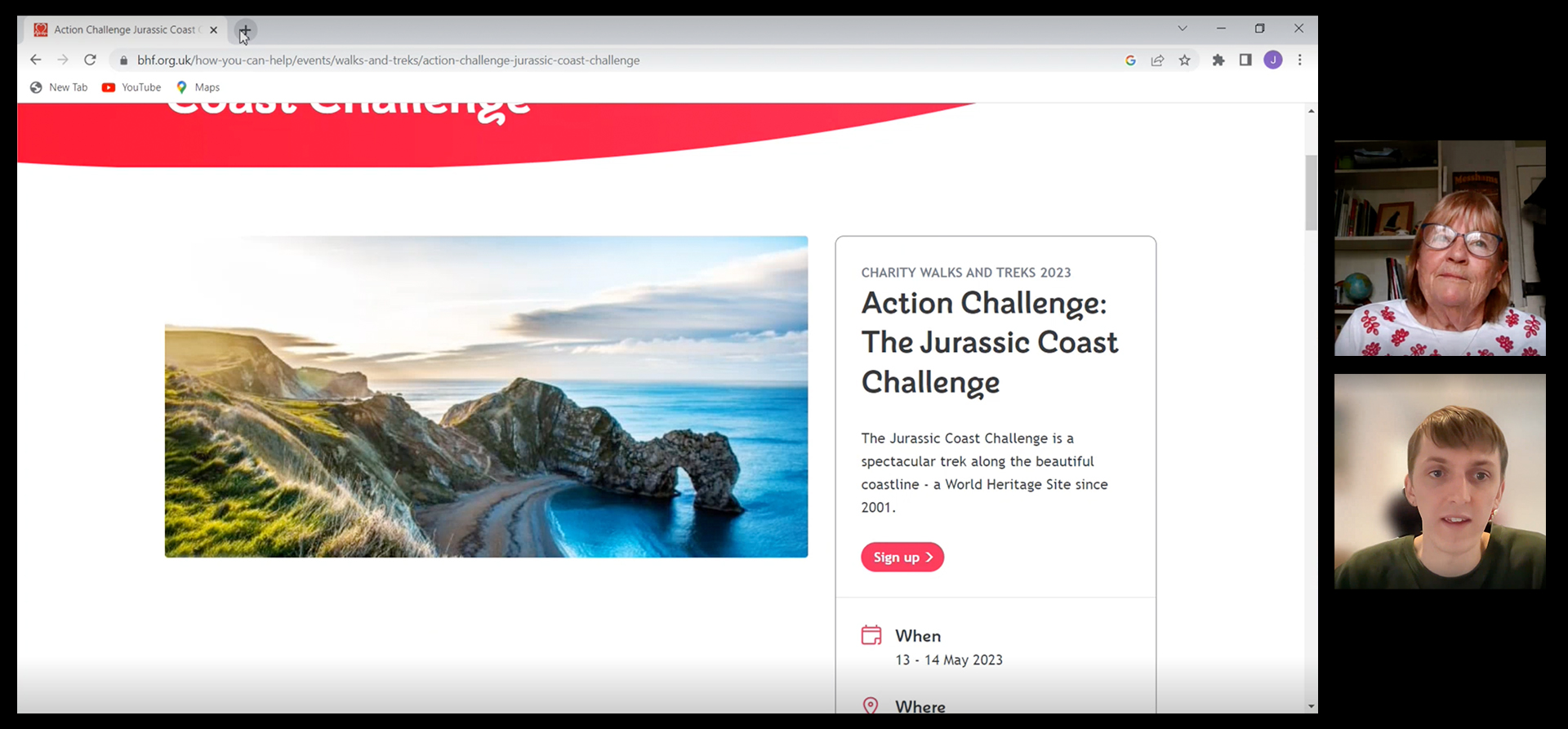
Unmoderated usability testing was used to compare the existing Events pages to the new prototype and to test different design ideas.
Participants were recruited using a short survey on the Events search page and testing was carried out in the form of short tasks on Useberry – our prototype testing tool. Tasks included, ‘show us how you would sign up for a Brighton Marathon ticket’ and ‘show us how you would set up a fundraising page’.
Once the tasks had been completed, each participant’s answers, click maps and session recordings were compared to identify the best design to move forward with.
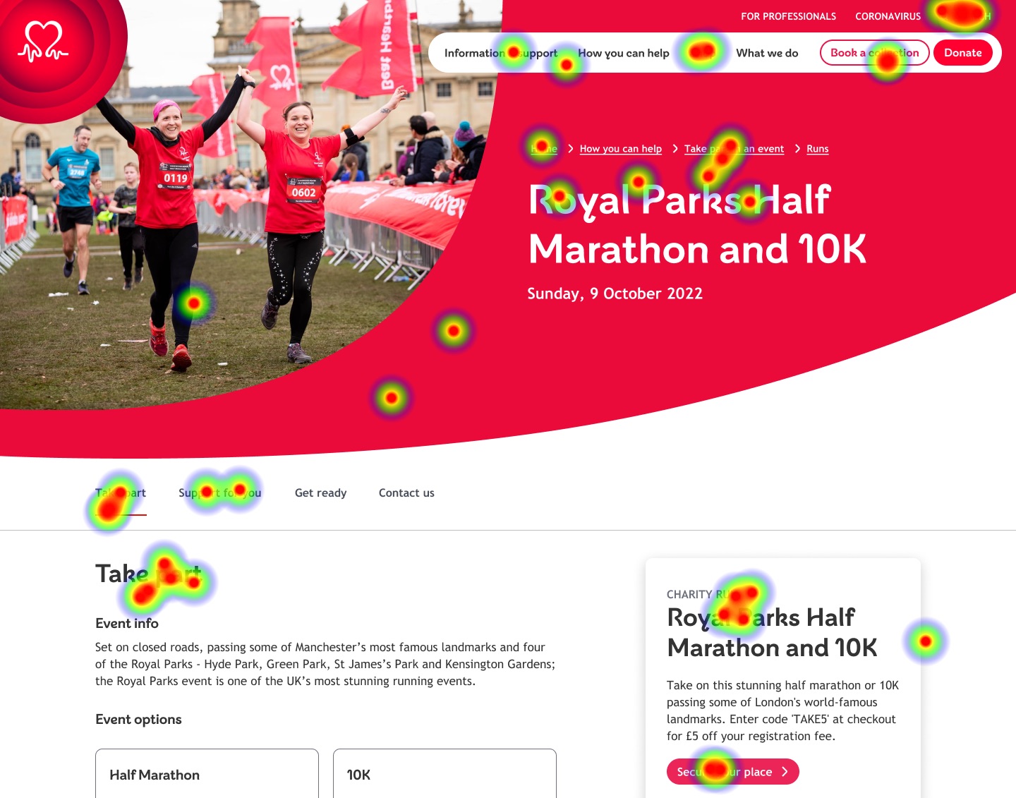
Findings
The results of the tests showed that users were finding the new prototypes easier to navigate than the existing pages. When testing the use of accordions compared with a sticky in-page nav bar, results showed that the nav bar allowed users to find the information they needed more efficiently.
However, there were still some issues to be improved which were noted and actioned. For example, some users found it difficult to locate the link to setup a Just Giving page and so the page structure was updated to improve this.
Phase 4: Deliver
4.1 Wireframes and new components
4.2 Next steps and projected outcomes
4.1 Wireframes and new components
At this final stage, I worked on creating the documentation needed to handover to the Development team. The wireframes were annotated with clear & concise instructions for the Developers and the new components were incorporated into the design system.
4.2 Next steps and projected outcomes
With the designs handed over but deployments still in progress, I am working closely with the Product Owner, Business Analyst and Developers to answer any design queries and assist with QA. In collaboration with the Content Designer, I have planned training sessions and drafted comprehensive best practice advice for the Events team on updating content and keeping the pages consistent.
Next steps
Once the full deployment has been completed, I will monitor the performance of the webpages using session recordings, heatmaps & Google Analytics to identify any additional improvements that need to be made.
In the near future, a broader project looking at improvements to the sign-up form and listing pages will also be conducted to further improve the Events section.
Projected outcomes
- An increase in event sign-ups
- Significant reduction in usability issues
- Improved consistency of content and easier update process for Events team
- Stronger SEO score
Reflection
During this project, we encountered some issues with stakeholders communicating their preferences to different teams at various stages of the project. In future, I would ensure that stakeholders had a single contact point for the project. This would help to prevent miscommunication.