
Motus Hotels App
About
Project consisting of work carried out for the Professional Diploma in UX Design at Glasgow Caledonian University, run by the UX Design Institute. The course followed the full life cycle of a UX project from conducting initial user research through to creating an interactive prototype.
My Role
I conducted a number of user-centred research methods and analysed results to extract key findings. These findings were then used to inform my approach to designing a working prototype and wireframes for Developer handover.
Client
Motus Hotels (Fictional Company)
Team
Predominantly solo. Collaborated with colleagues during the research and analysis phases
Duration
6 months
Tools used
Adobe XD, Figma, Miro, Photoshop, Illustrator, Camtasia, After Effects, Zoom
Challenges
Simplifying the process
As a new hotel chain, Motus Hotels needs to enter the market with a simple and efficient customer booking process.
Competition
While keeping to the conventions of the industry, common usability issues on existing hotel apps and websites need to be avoided.
Case Summary
Hypothesis
An efficient booking process (in this instance, within a mobile app) will encourage customers to stay at Motus Hotels and move away from other hotel chains with ineffective, frustrating booking systems.
End Product
The result of the UX process was a mobile app with a fluid user experience and without frustrating features and complexities found in competitor apps.
Projected outcomes include:
- Increased conversion rate and reduced customer dropout
- Reduced demand on the reservations team due to the improved digital booking process
Framework
Double Diamond
Following the Double Diamond framework, I considered the big picture first and the specific interactions later. I started by asking several broad questions, including:
- Why do so many users drop out along the booking process?
- How can we speed up the process?
- What are the most important elements of a great booking experience?
- How might we be to able up-sell without compromising the user experience?
Utilising this approach throughout the project allowed me to explore broad-ranging user issues before taking more focused action.
Process
UX is a research-based discipline
Phase 1: Research
1.1 Competitive Benchmarking
1.2 Online Survey
1.3 Depth Interviews
1.4 Usability Testing
1.1 Competitive Benchmarking
Competitive benchmarking was utilised to fulfil three main objectives:
- Learn how best-in-class apps avoid problems that can occur during the booking process
- Gain an understanding of the conventions that are followed within the hotel industry
- Highlight strong design elements to emulate and ineffective features to avoid
To ensure my findings were as fruitful as possible, I selected a number of hotel brands that were succeeding within the UK market. The competitors chosen were Premier Inn, Hilton Honors, The Montcalm, NH Hotel Group, and IHG.
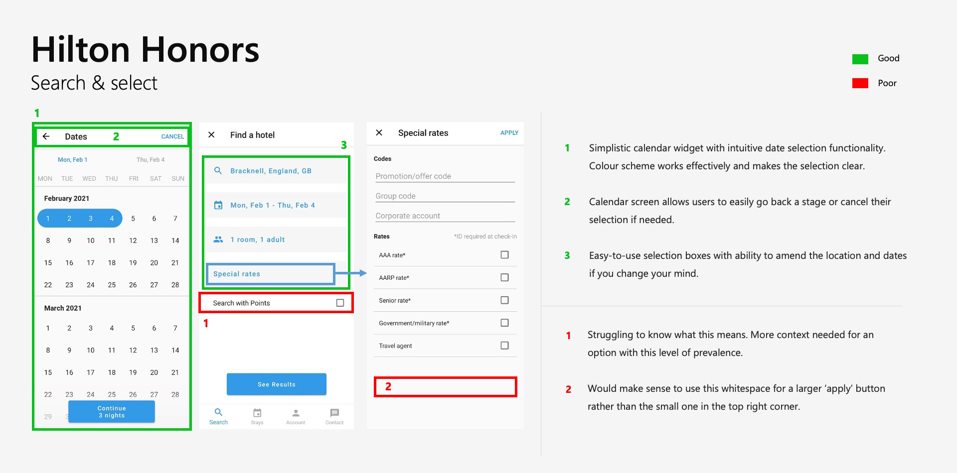
Key findings
- As an industry standard, most competitors include functionality that allows users to switch between list and map view when browsing hotels. This seems to be an effective feature.
- Several hotel booking apps fail to provide a clear and easy-to-use date selection tool.
- Some hotel apps display long lists of offers, promotions, or ‘special rates’. This should be avoided.
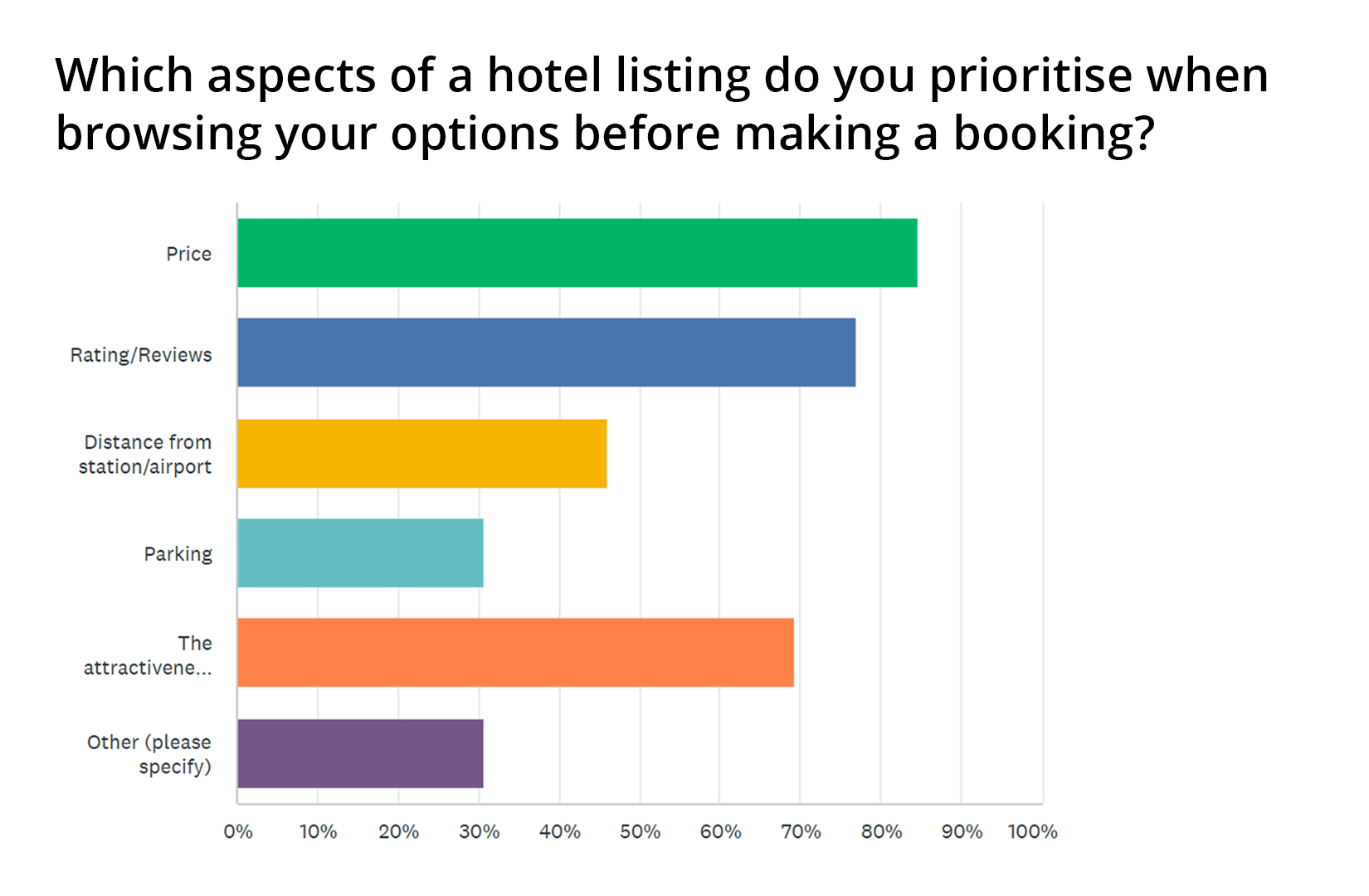
1.2 Online Survey
An online survey was utilised as a tool for understanding the broad goals, behaviours and context of hotel customers.
The survey was composed of a mixture of 10 open and closed questions and was completed by 22 respondents. Using LinkedIn and Facebook, I aimed to recruit a broad sample of participants who matched the criteria set out in the recruitment screener, with a particular focus on targeting 20 to 55-year-old men and women.
The responses from the survey contained rich qualitative and quantitative data and provided a useful starting point for the rest of the research phase.
Key findings
- Users will often revisit a hotel app/website several times before making a decision and do not like to be rushed in the process.
- Price and reviews are the most important factors when selecting hotels.
- Users dislike hidden fees and extensive promotions.
1.3 Depth Interviews
Using a recruitment screener, consent forms, and the list of contact details I had obtained in the survey responses, I recruited a sample of 5 participants for the interviews and usability testing sessions.
Each interview was conducted with the aim of understanding the usual context of a guest’s hotel booking process (e.g. their common reasons for travel and their preferred hotel apps). Scope also included how they share information with one another when choosing hotels as a group and how many times users typically return to an app before making a booking.
Key findings
- Users explained that refundability was often a key aspect of their hotel selection. They like to be able to easily find information on free cancellation.
- All of the respondents emphasised value for money and location as key hotel features. Therefore, the price and location of each hotel option needs to be prominent at key stages throughout the process.
- Users mentioned brand trust and stated that they go into the process of booking with fewer concerns when they know they can trust the company.
1.4 Usability Testing
The usability testing sessions were conducted remotely on Zoom (due to Covid-19 restrictions) and followed on directly from the depth interviews with each participant.
Before running the sessions, I defined the objectives for the usability tests (see below) and decided on the apps that would be tested. I then wrote a script for the sessions, ensuring that I didn’t ask leading questions or closed questions that would be unfruitful.
Objectives
- Identify typical user behaviour on The Montcalm and NH Hotel Group apps.
- Discover the primary goals of the user.
- Discover which features conform to the user’s expectations.
- Discover which features do not conform to their expectations.
- Identify elements that cause friction.
- Learn what kinds of problems will cause the user to leave the app.
- Discover where and when users feel empowered and frustrated during the journey.
- Identify which pieces of information are important for the user.
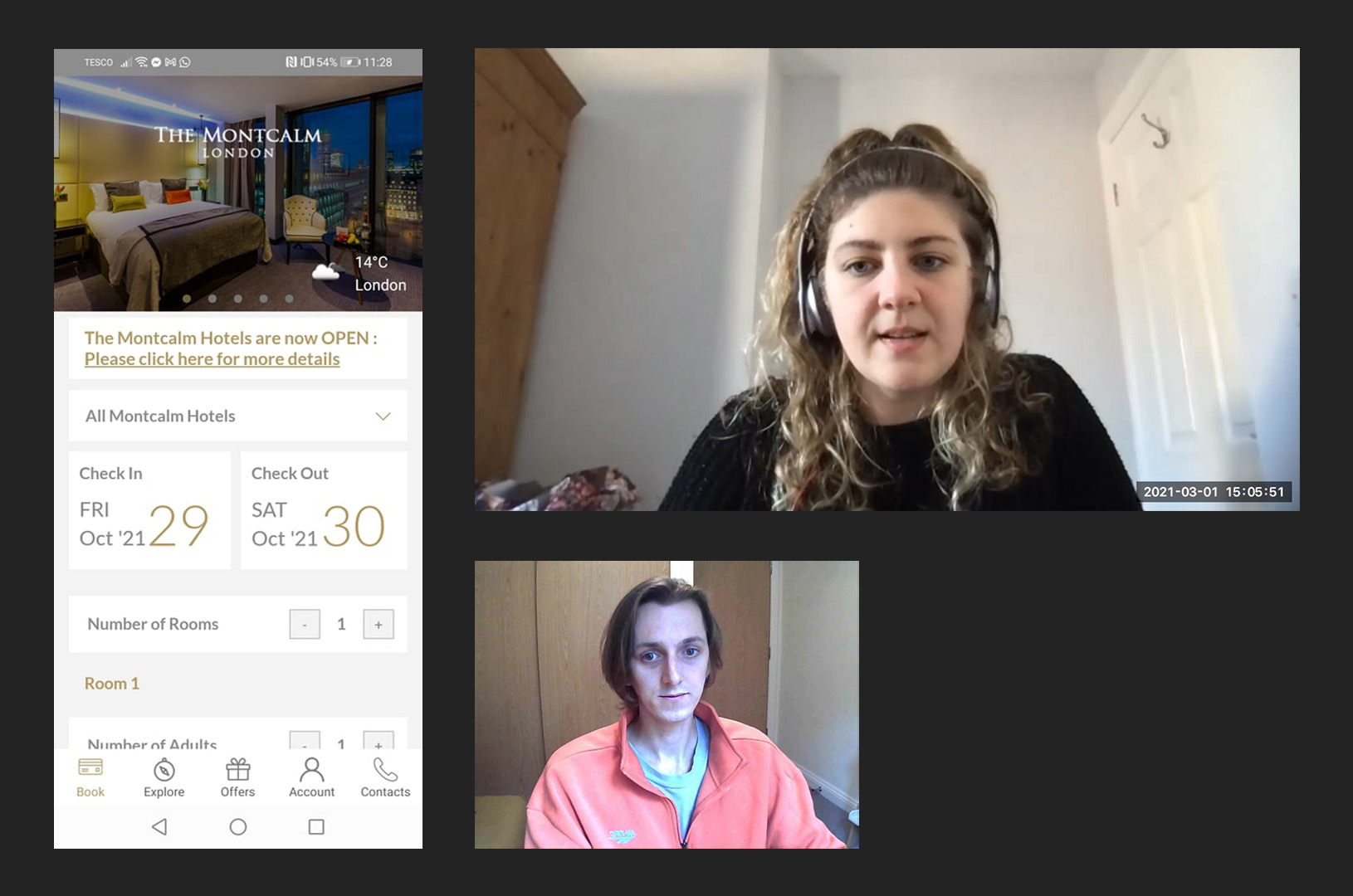
Key findings
It was surprising to see that none of the participants had a seamless booking experience. Even people who frequently book hotels struggled with some of the steps in the process.
Although each user’s pain points and frustrations were different, they often centred around the search functionality. In particular, several users found the date picker overcomplicated and questioned why it wasn’t more intuitive. “Isn’t there a way to do this quicker?” was a phrase that came up more than once while users navigated selecting the booking dates.
Other useful quotes included, “All these add-ons are a bit unnecessary” and “I would like to see the TripAdvisor rating for each option.”
Making the data speak
Phase 2: Analyse & Define
2.1 Affinity Diagram
2.2 Customer Journey Map
2.1 Affinity Diagram
The ‘analyse and define’ phase was focused on structuring the unorganised data and extracting the key findings from each research method. To accomplish this, I organised a remote affinity diagram session with a colleague using Miro (run virtually due to Covid-19 restrictions).
Prior to the session, the usability test recordings, depth interviews, competitor analysis, and survey results were all reviewed and detailed notes were taken.
My colleague and I then transferred the notes to virtual sticky notes and began organising them into groups. We then compared and discussed the groups we had created and agreed on more specific categories. Clear priorities emerged which provided a useful basis for the design phase.
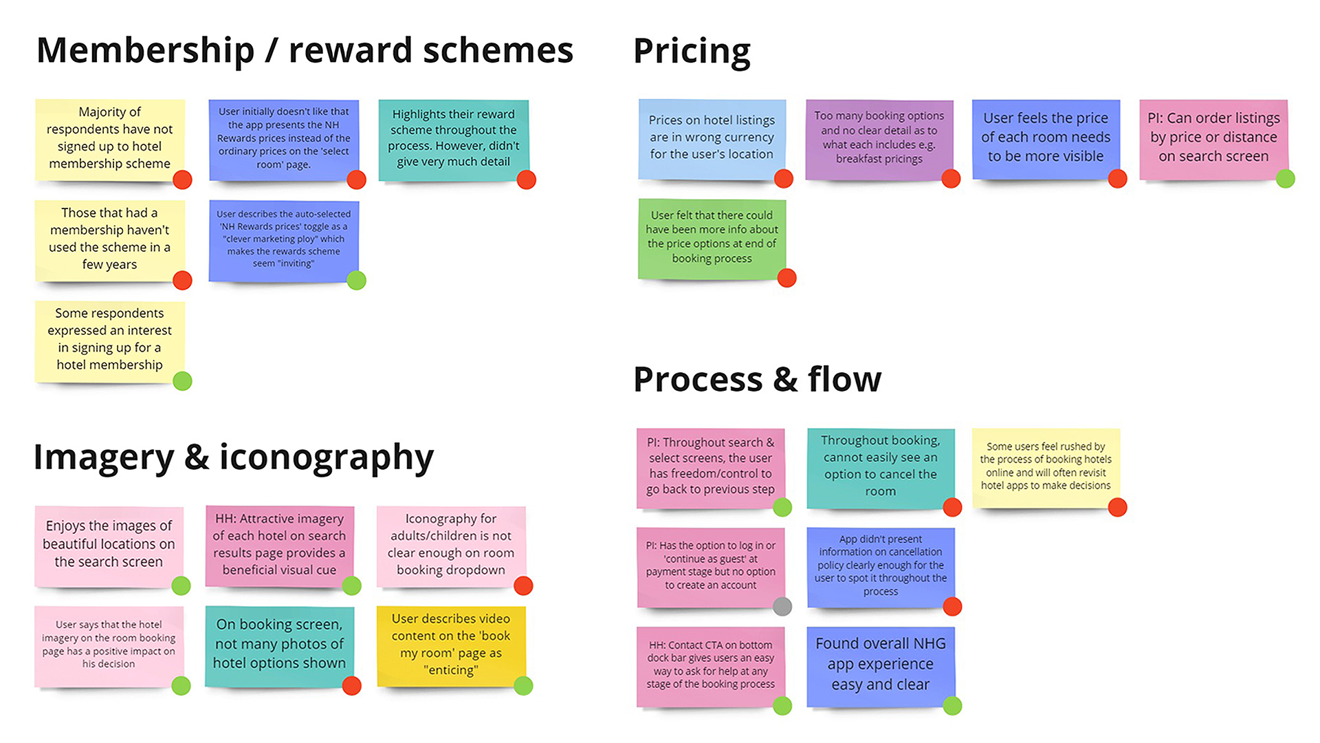
Reflection
- The affinity diagram session highlighted the importance of collaboration. Having two minds working on grouping the notes led to patterns and priorities emerging that may have otherwise been missed.
- For future UX projects, it would be beneficial to scale this up and carry out the exercise in-person with a larger group.
2.2 Customer Journey Map
To build on the structure of the affinity diagram and to bring the process to life, I created a visualisation of the user journey. Clear, high-level stages in the booking process were defined. For each step, the customer’s mood, expectations, behaviours, positive experiences, and pain points were noted.
Throughout the design and prototype phase, the customer journey map proved useful for confirming ideas and refocusing my attention on the key stages of the user journey.
Key findings
It became clear that the stages that required the most improvement and therefore needed to be prioritised during the design phase were:
- the search feature
- the date picker
- and the offers and extras / add-ons section
Design is thinking made visual
Phase 3: Design & Validate
3.1 User Flow Diagram
3.2 Interaction Design Sketches
3.3 Prototypes (Medium to High-Fidelity)
3.4 Prototype Usability Testing
3.1 User Flow Diagram
After empathising with users and identifying the key issues, I set about developing solutions to improve the hotel booking process. Improvements included:
- reducing the stages involved in the ‘search and select’ process
- preventing add-on screens from impeding progression
- removing unnecessary ‘special rate’ screen states
- delaying the login / sign-up stage until a later phase when it becomes beneficial to the user
The flow diagram was modified and evolved through multiple iterations in order to refine the user experience.
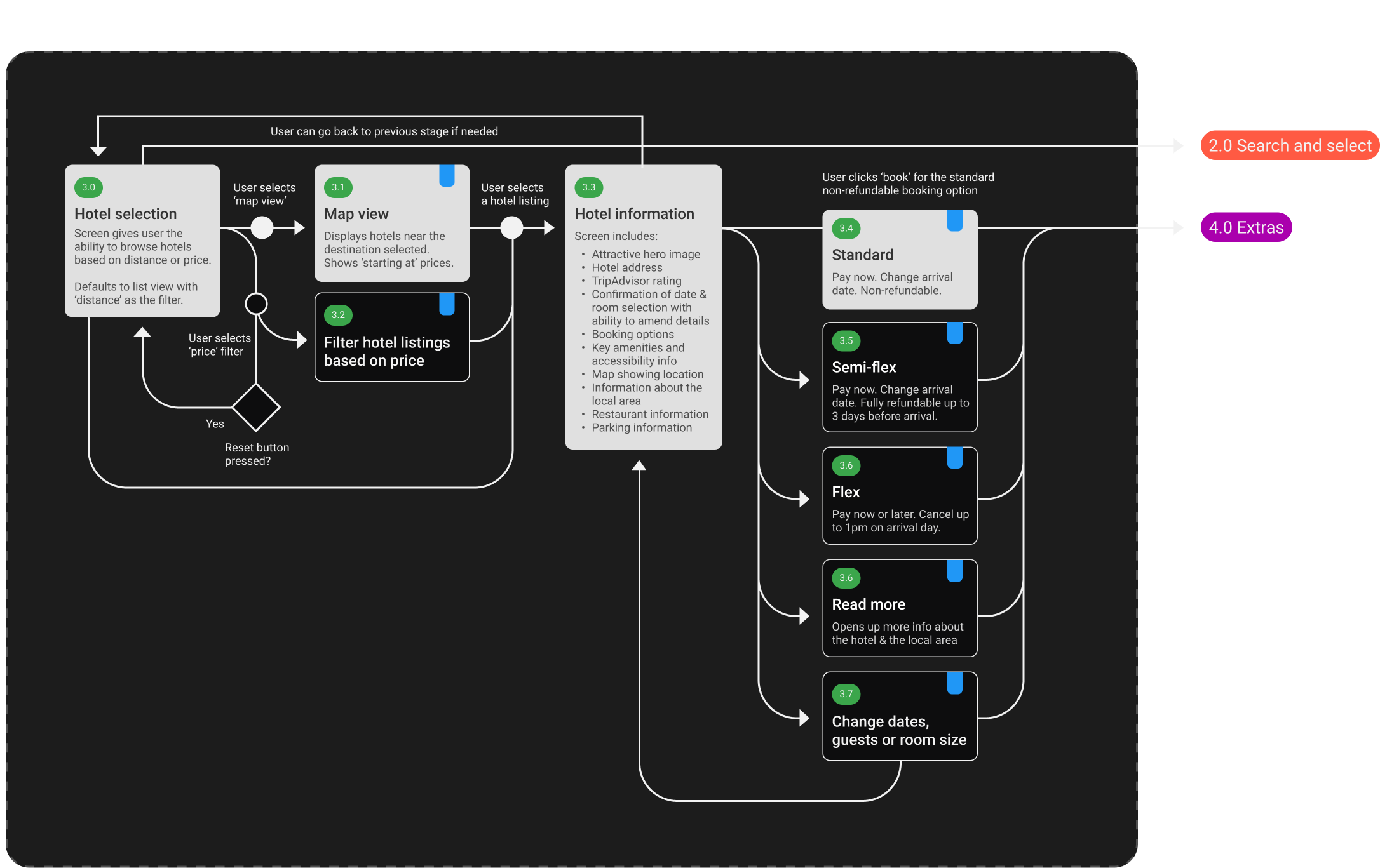
Section from user flow diagram
3.2 Interaction Design Sketches
With the framework in place, attention was now turned to sketching the screens and their interactions. Employing a clear visual hierarchy and ensuring affordances were in place, I was able to create the beginnings of an effective, efficient, and visually appealing app.
This was an iterative process in which constraints were highlighted and addressed before moving on to prototyping. Improvements included making the ‘find locations near me’ option easier to locate, changing the toggle used for selecting room options, and removing the preview of the map view on the hotel options screen. Each change was made to simplify the user interface and improve the overall flow through the app.
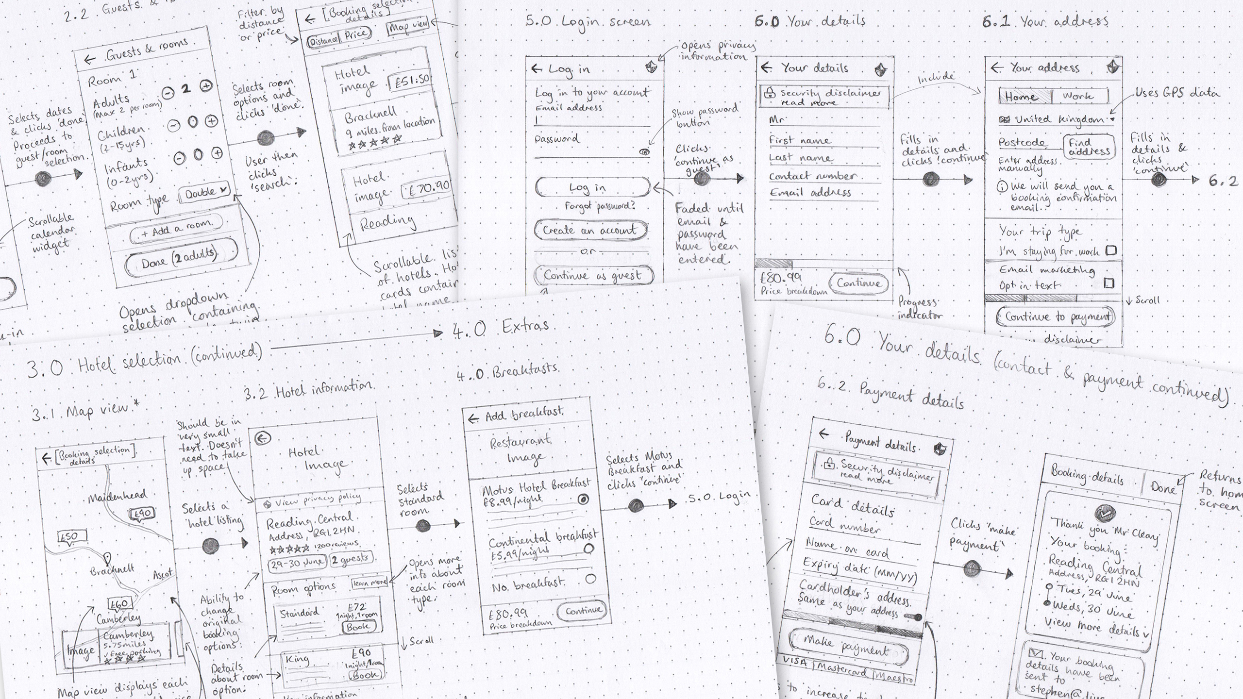
Reflection
- Sketching gave me the ability to visualise how usability problems could be resolved through the careful design of each screen and screen state.
- Although rough sketches are not the most aesthetically pleasing, they proved a time-efficient method and allowed for quick iteration.
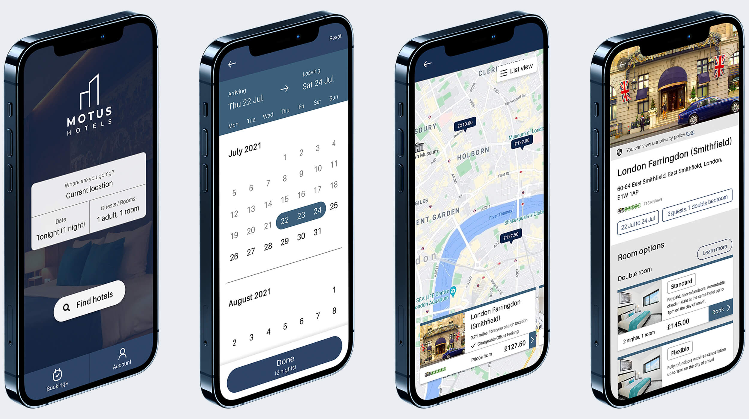
3.3. Prototypes (Medium to High-fidelity)
Implementing the visual direction defined during the sketching process, medium-fidelity and high-fidelity prototypes were created using Adobe XD. On each screen, I included elements that directly address user goals, needs, and frustrations, while also incorporating common design features seen on other hotel apps.
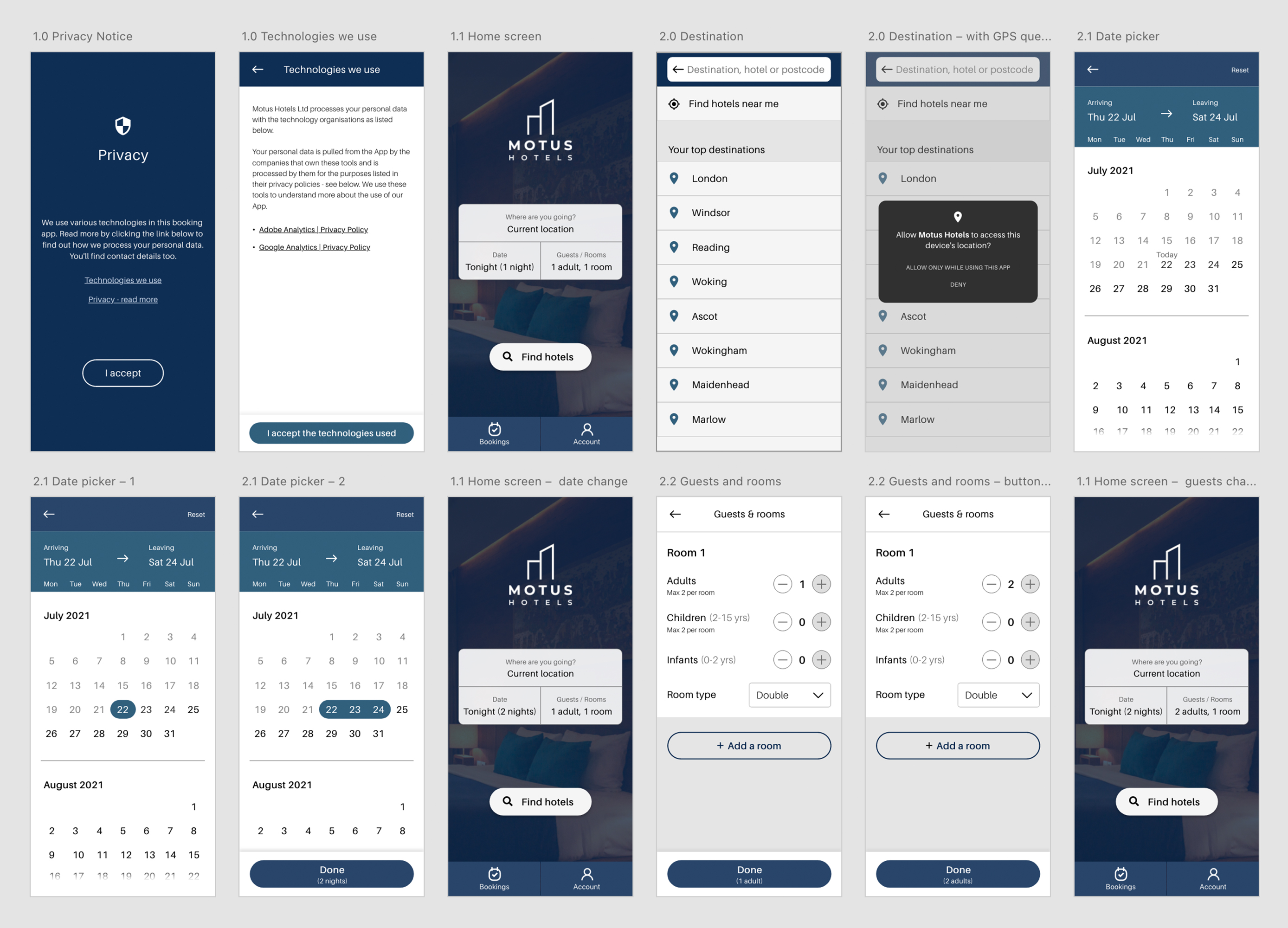
Reflection
- Opting to develop a high-fidelity prototype allowed me to further refine the interactions, aesthetics, and flow. The result was a detailed deliverable that could be annotated to make the final task of developing the app as manageable as possible.
- Prototyping in medium and high-fidelity was, however, a time consuming process compared to rapid prototyping using pen and paper.
3.3. Prototype Usability Testing
Throughout the development of the prototype, several versions were tested in usability sessions. This was a crucial step and ensured the end product was validated and refined. Changes implemented after testing included:
- Hotel price labels on the map view were reduced in size. This was implemented because users were struggling to pinch and drag the map without accidentally clicking on individual listings.
- Adding confirmation of booking dates and number of guests to the hotel listing screens to put users at ease during the process and as a useful reminder.
Reflection
When working on future projects, I would put the prototype through a more vigorous testing and validation cycle so it could be improved further before final delivery.
UX is a problem-solving disclipline
Phase 4: Deliver
4.1 Wireframes
4.2 Conclusion
4.1 Wireframes
At this final stage, I worked on creating the documentation needed to handover to the development team. The wireframes were annotated with detailed and concise instructions for the developers.
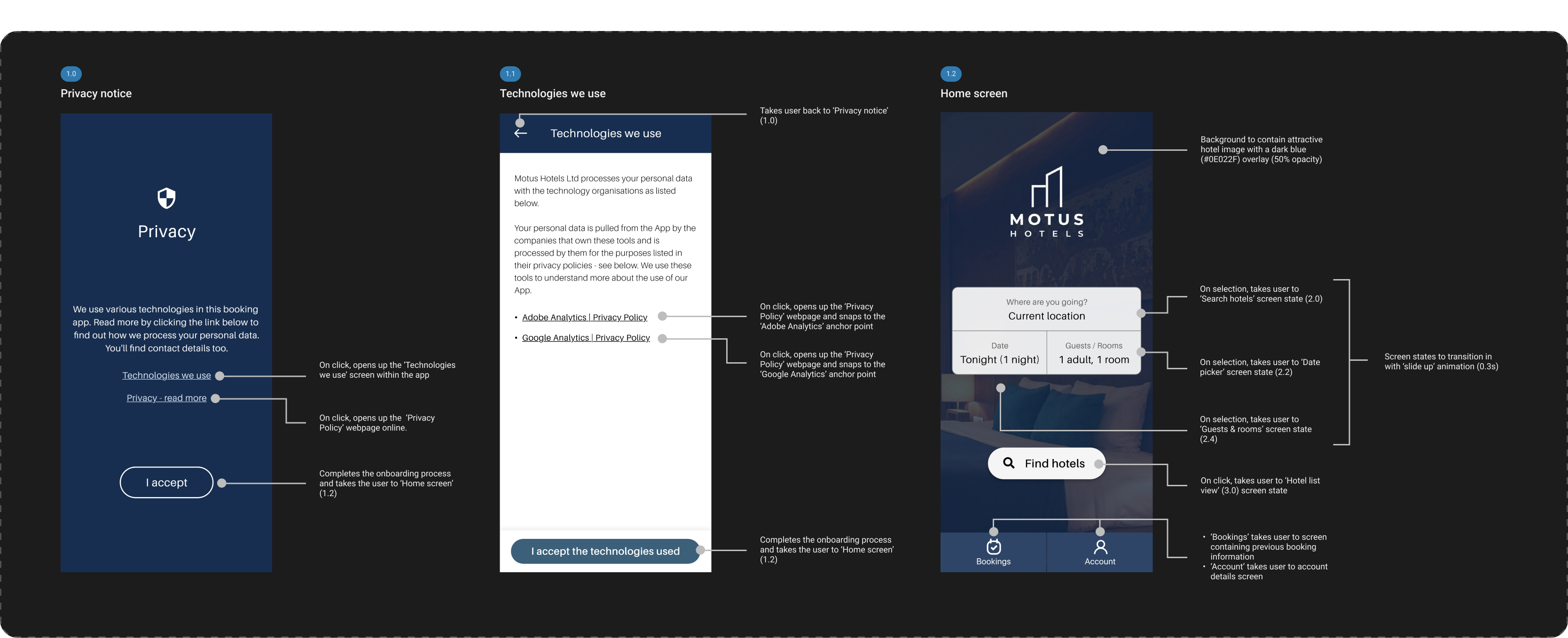
Reflection
- This proved to be a valuable exercise and allowed me to work on my written communication through wireframe annotations.
- It was important that I avoided unnecessary jargon and wrote using vocabulary that developers would understand.
4.2 Conclusion
I am pleased with the end result of this UX project. The new app resolves the problems identified during the research phase and provides an effective and attractive hotel booking experience.
Reflection
Whilst I aimed to utilise industry conventions during the process, it became clear that it was worthwhile re-thinking some common practices. For example, several hotel booking apps use off-canvas menus which, according to the results of my usability tests, tend to overcomplicate the process. Instead of conforming to existing conventions, I chose to utilise dock tabs and in-content navigation which achieved a simpler design.
Improvements
The process would have benefited from increased testing and collaboration throughout the UX lifecycle. In a real-world project, I would ensure that heat mapping analysis, A/B testing, and KPI reviews were completed regularly following release, with findings helping to aid continuous improvement.