
")
Online Prospectus
About
Royal Holloway University of London decided to create an interactive online prospectus with a view to attracting more students, staying ahead of competitors, saving money and reducing environmental impact.
My Role
I was responsible for designing all aspects of the prospectus end-to-end from initial wireframes on Adobe XD through to a hi-fi, in-browser prototype. All designs needed to reach AA Web Content Accessibility Guidelines (WCAG). I led regular meetings with team members and briefed the Developers on design specifications to ensure the prospectus was engaging, user-focused and accessible.
Company
Royal Holloway
Team
Digital Team
Web & Mobile Apps Team
Duration
4 months
Tools used
Adobe XD, Miro, Azure DevOps, Asana, MS Teams, WordPress, Umbraco
Challenges
User experience
Prospective students need a one-stop shop where they can quickly access key information about studying at Royal Holloway.
The need for a new microsite
A new template is required with interactive elements and multimedia content that will keep users engaged.
Audience insight
51%
of the Royal Holloway applicants surveyed felt that the existing print prospectus was too long.
Only
26%
of university applicants in 2021 used a hard copy of a prospectus before applying according to SMRS survey results.
57%
of Royal Holloway applicants stated that the sustainability credentials of prospectuses are important to them.
Incentives
Delivering on student expectations
Industry-wide research indicates that students are more likely to obtain information digitally than within a printed prospectus. Akero’s Pulse Survey (2021) showed that university websites, UCAS and Google were the top ranking information sources for prospective students. It therefore made sense to reduce the size of the print prospectus, improve the sustainability of the materials used and turn our focus toward creating an engaging online prospectus.
Getting ahead of competition
Our competitor analysis highlighted that most universities were still primarily using print prospectuses and very few were offering a fully digital version. A clear opportunity arose for Royal Holloway to be one of the pioneers, offering a curated, engaging and interactive online prospectus.
Design Solution
Navigation
Local navigation with smooth scrolling
With a view to keeping students within the microsite rather than encouraging them to browse other website sections, we utilised a localised navigation menu. Each menu item in the navigation was designed to trigger a smooth scroll down to a specific anchor point within the page.
Importantly, we retained the ability to navigate back to the main homepage by clicking the Royal Holloway logo. This ensures users are easily able to navigate away if they have accidentally landed in the web section.
Navigation smooth scrolling to anchor points on low-fi prototype
Motion
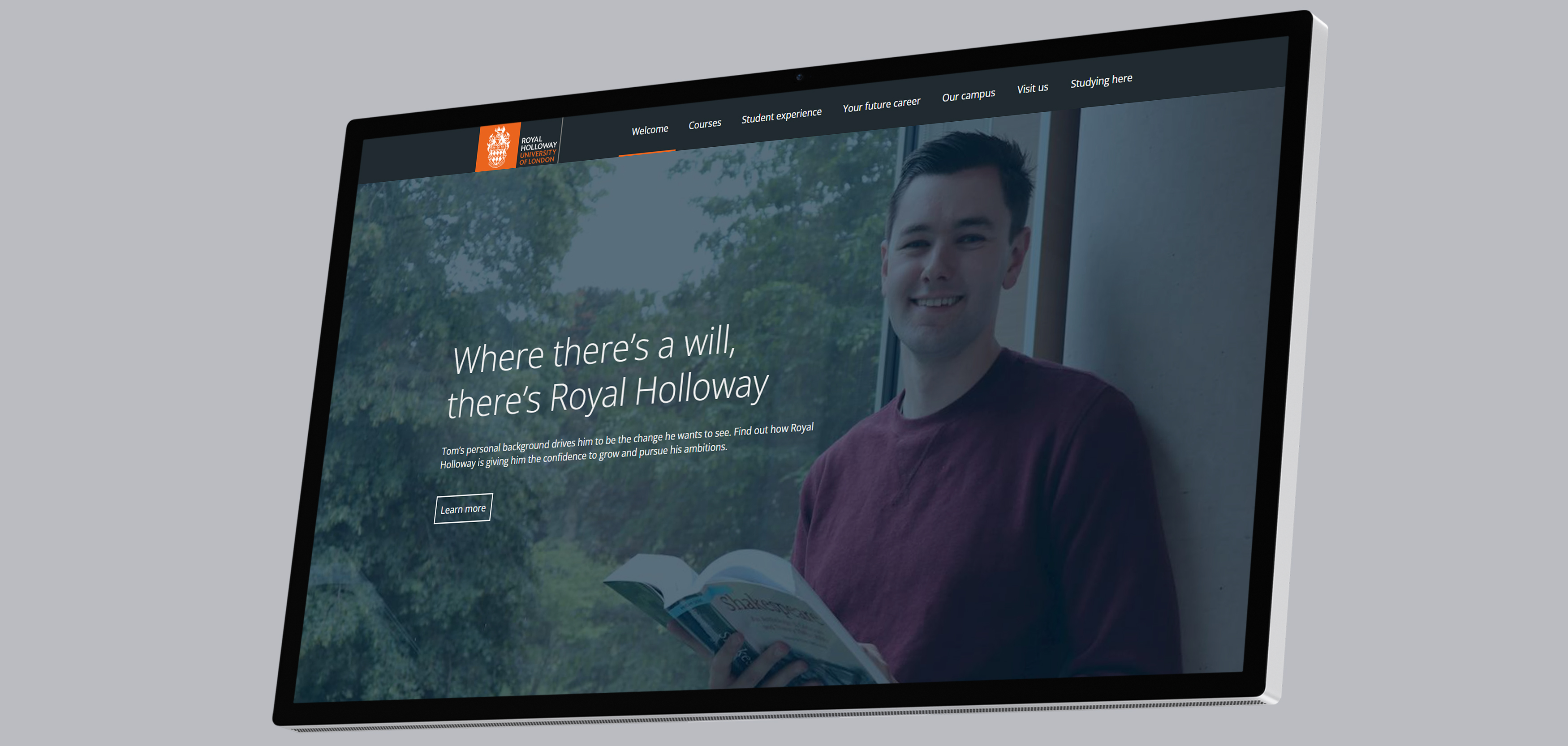
Full screen animations and subtle transitions
Animations and transitions were used to keep prospective students engaged whilst using the online prospectus. Taking inspiration from animations used on other websites (e.g. parallax scrolling on the Patagonia site), we decided to use images that expand to fill the screen as the user scrolls. This motion gives the user the feeling of going on a journey and provides a more immersive experience.
Expand-to-fill animation
Course search feature
Integrated course selection tool
Working closely with the Developers in our Web & Mobile Applications team, I designed a course search and selection tool that could be used within the Online Prospectus. This is arguably the most important feature within the microsite and allows prospects to customise the page to match their course interests.
Course search and select tool
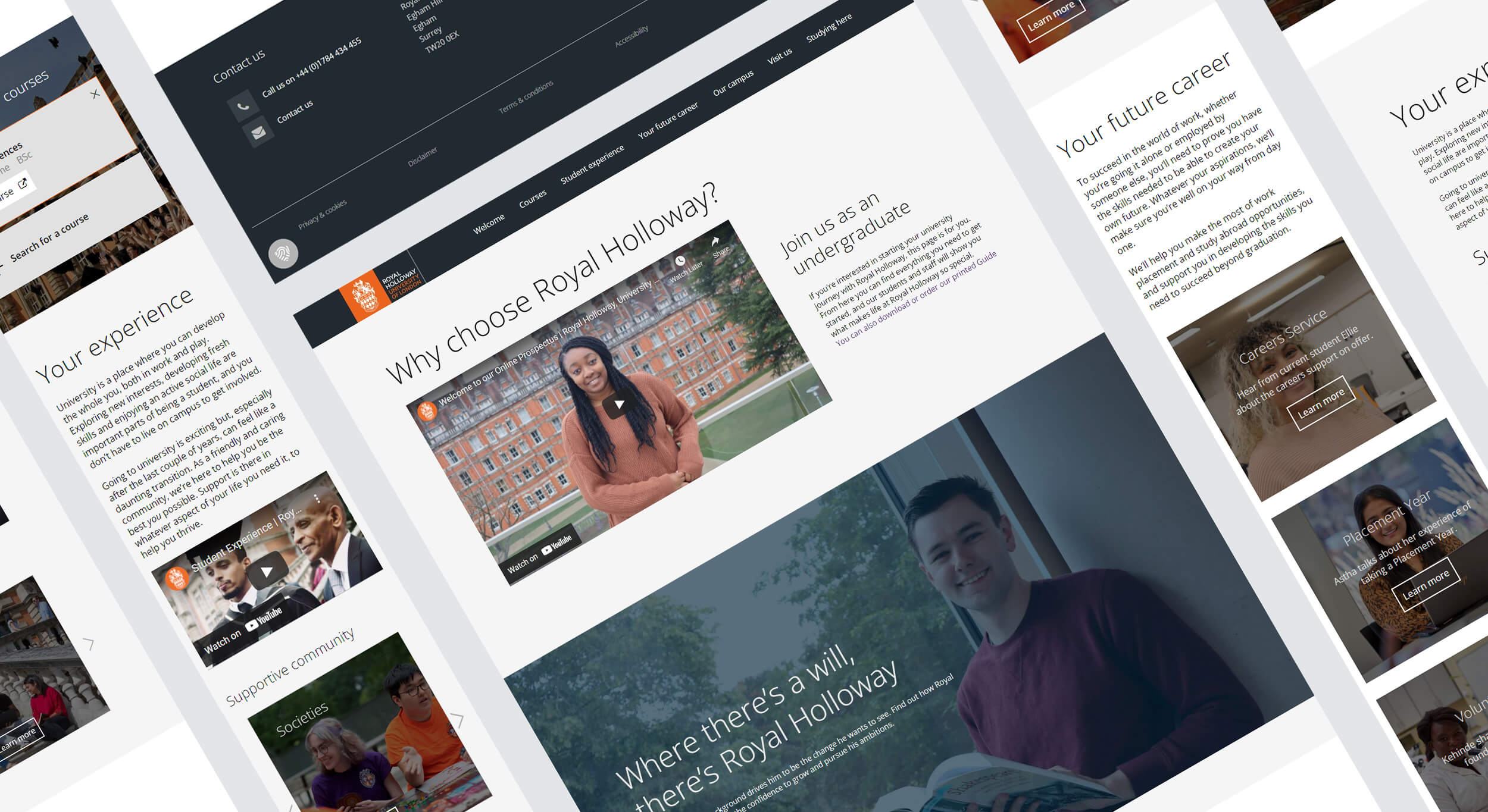
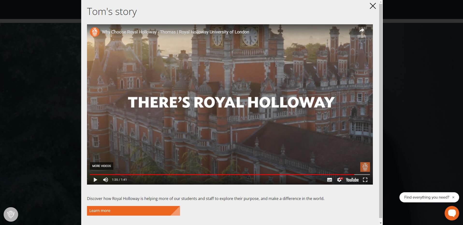
Multi-layered content
Utilising responsive modals
We used a two layer structure for the microsite to enable users to access information efficiently without needing to browse multiple webpages. Responsive popups were used containing text and engaging multimedia content.
A/B Testing results
After the first iteration had been deployed to the website, I analysed scroll maps for the page which showed that less than 65% of users were reaching the end of the page. With a view to improve this scroll rate, we reduced the length of the page and used modals more extensively. We then ran an A/B test which showed the shortened version had an improved scroll rate and increased overall engagement.
Responsive design
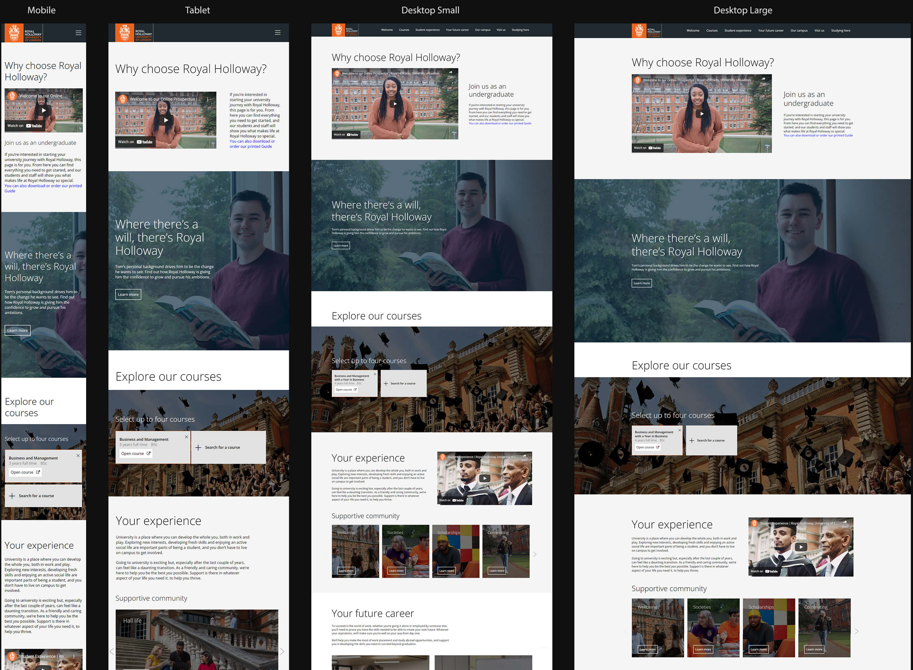
Web Optimisation
Based on the most frequently used sizes and utilising Royal Holloway’s existing design system, I created responsive web-optimised designs for each breakpoint: Desktop Large Horizontal Screen (1440px), Desktop Small (1024px), Tablet (768px), and Mobile (360px).
Results
High click through rate to course pages
With the end goal of the project being to encourage students to consider studying at Royal Holloway, it was encouraging to see a 61.4% click through rate to course pages using the integrated course search.
Over 70% reduction in prospectus production costs
The length of the printed prospectus and total number printed & posted was significantly reduced in line with user insights. The result of these changes was a 70% reduction in cost.
Learnings
Working with Developers
Working closely with a small group of Developers during this project taught me the importance of being very precise and specific about design specifications. When instructions weren’t clear enough, it would often materialise as a visual mistake or inconsistency which would then need to be dealt with. Throughout the project, I made sure to provide clear guidelines and held regular update calls with the team, reporting back to key stakeholders to ensure everyone was kept up-to-date.
Tight deadlines and agile working
Website and software development projects often run on longer than the expected timeline due to the need to continuously develop and improve the end product. For the Online Prospectus, we managed to deliver the MVP before the assigned deadline but, several months on, we were still making adjustments and improvements during 2-week development Sprints.
This project highlighted the benefits of using the Agile methodology and working iteratively to ensure the final microsite is as useful to prospective students as possible.